
This audit examines the visual and verbal identity of smartShift to see how well the brand is being communicated, and suggests how to improve things.
smartShift positions itself as a leader in automated SAP transformation, helping enterprises modernise custom code with speed, accuracy and guaranteed outcomes.
Over more than two decades it has developed a proprietary automation engine that has remediated billions of lines of ABAP code across thousands of SAP systems.
The platform supports global enterprises through large-scale S/4HANA migrations, Clean Core programmes and cloud transitions, with fixed-price, fixed-timeline delivery that replaces traditional manual remediation.
Competitors
The brand shows signs of partial updates over recent years, but not a full, unified refresh. Newer elements sit alongside older content, creating a disconnect with the company’s position as an automation- and AI-driven platform.
01Naming
Twenty-plus years of equity and an intentional, consistent casing. The name is strong and recognisable, with an opportunity to lean into ‘smart’ more in the brand and positioning. Note that several other ‘smart shift’ companies appear in search.
02Logo
The cloud-shaped mark feels generic and appears unchanged for many years. It doesn’t communicate automation, speed, platform intelligence or AI. A refined, modernised mark could keep continuity while representing technological leadership.

03Colour system
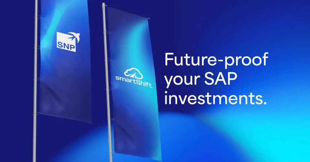
The palette varies significantly across web, social, events and print. What we like to call ‘50 shades of blue’. A unified, modern colour system is one of the quickest, most impactful improvements.


04Typography
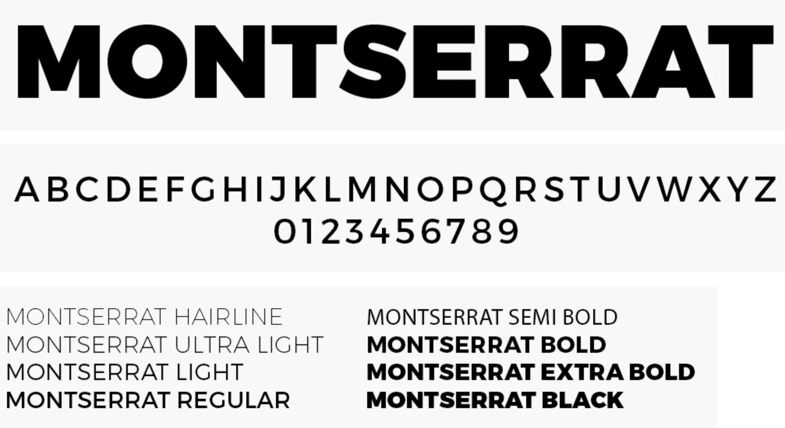
Montserrat is accessible and practical but widely used by corporate and government organisations. A more characterful, technical heading face would align with automation, engineering and AI.
05Imagery
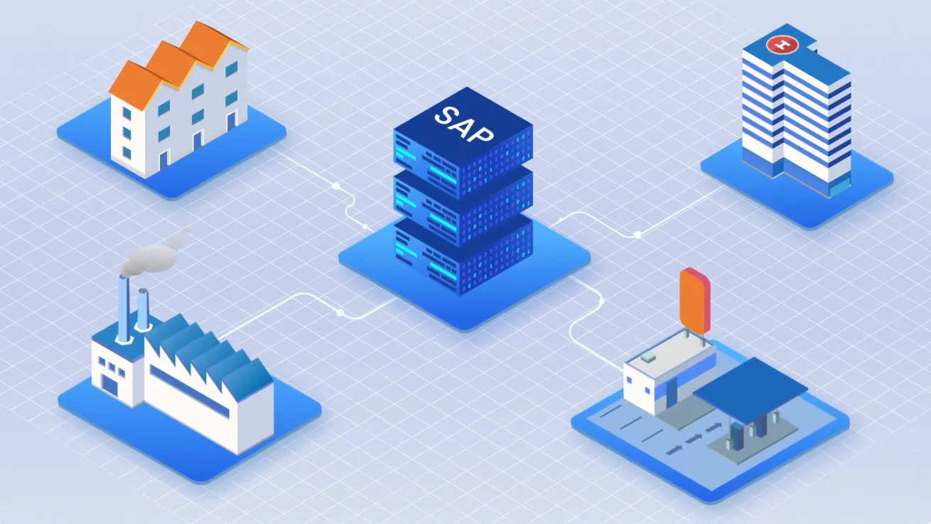
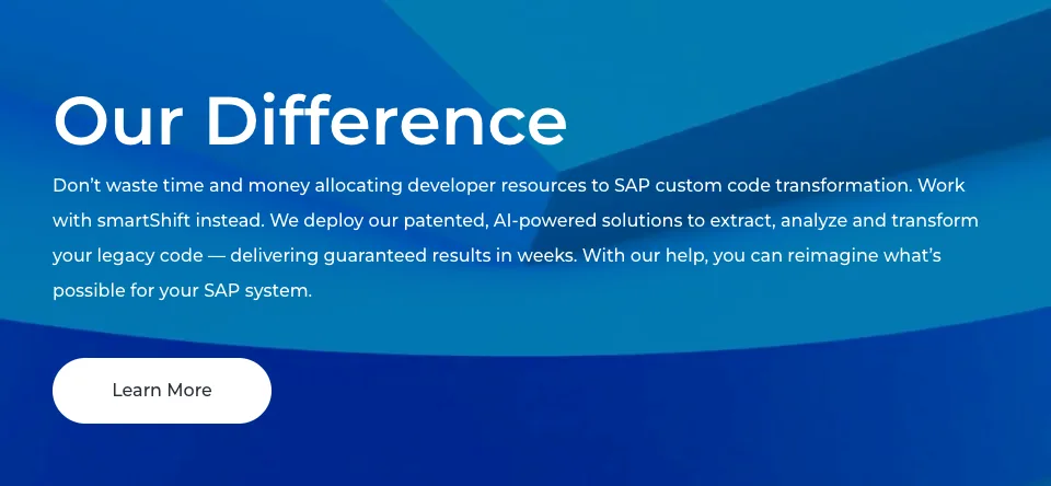
Mostly stock photos or tinted blue overlays, which look dated and inconsistent. A suite of branded visuals would bring clarity and distinction.

06Motion
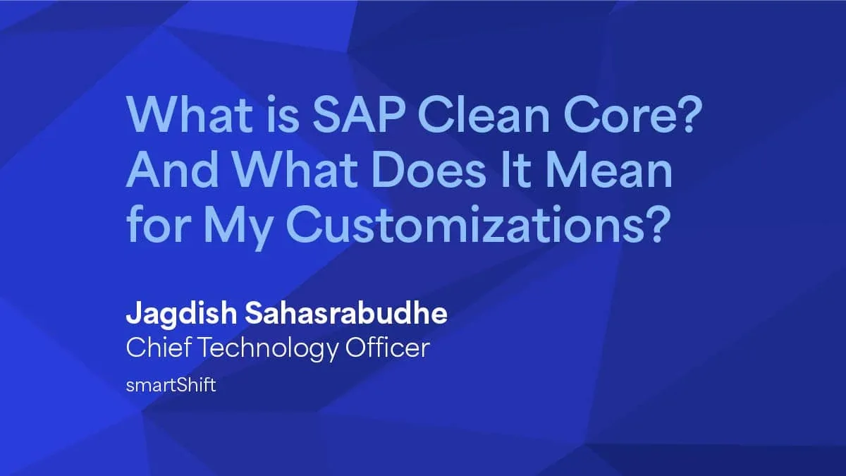
Motion is key to communicating automation, yet many animations look like recoloured stock footage. Purpose-built motion assets would express the technology.
07Video standards
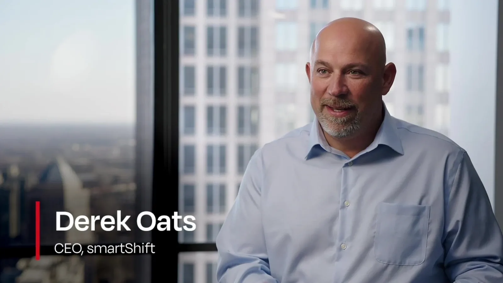
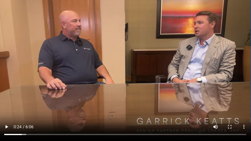
A noticeable quality gap between flagship and basic pieces. A library of branded intros and lower-thirds would help teams produce consistent, polished content.

08Website
Solid and needs no structural change. Apply refreshed imagery, motion, type and colour with your developers, with no major redevelopment.

09Event presence
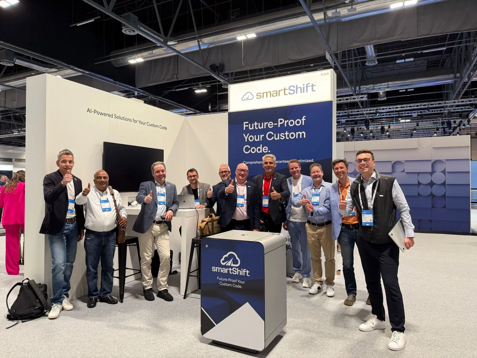
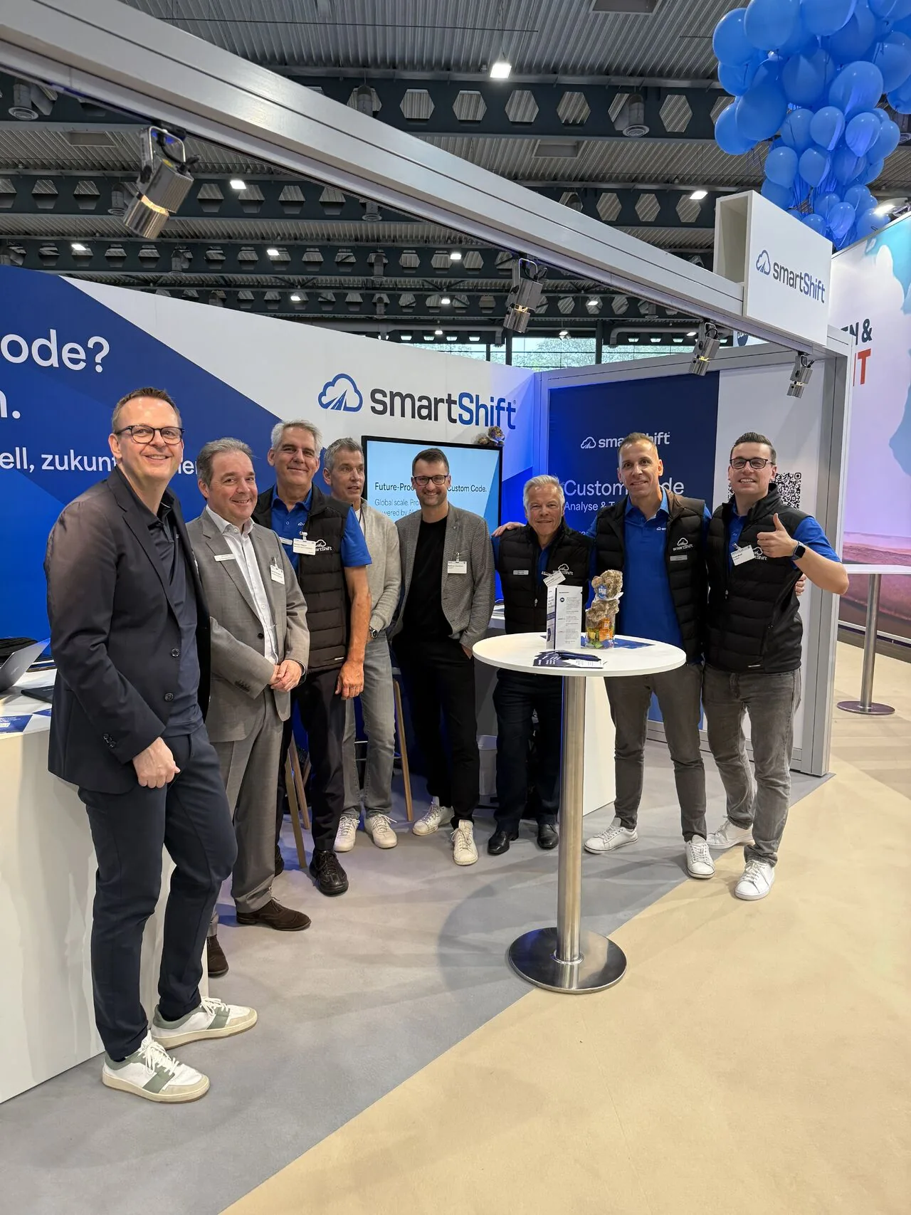
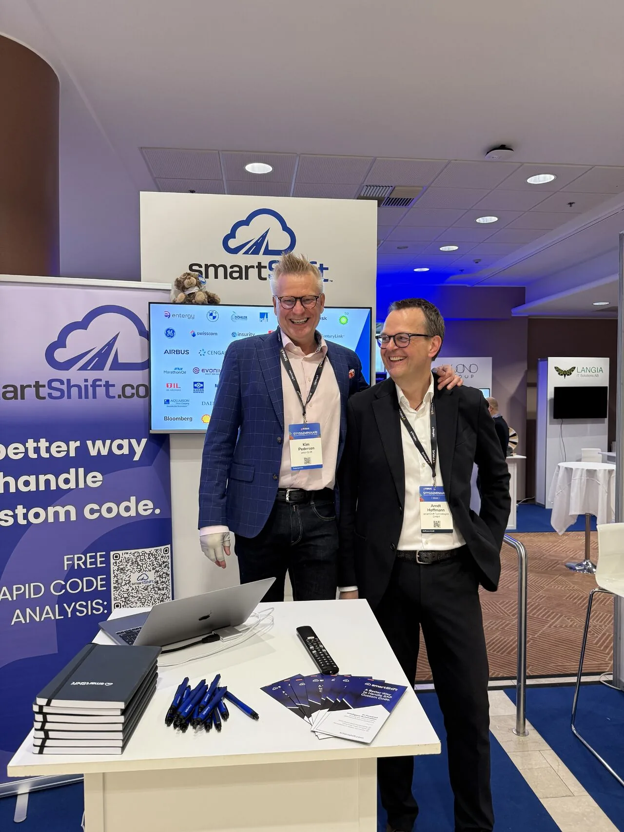
Pull-ups and stands use standard corporate styling and blend in with other enterprise vendors. A consistent suite of event assets and explainer loops would help smartShift stand out.
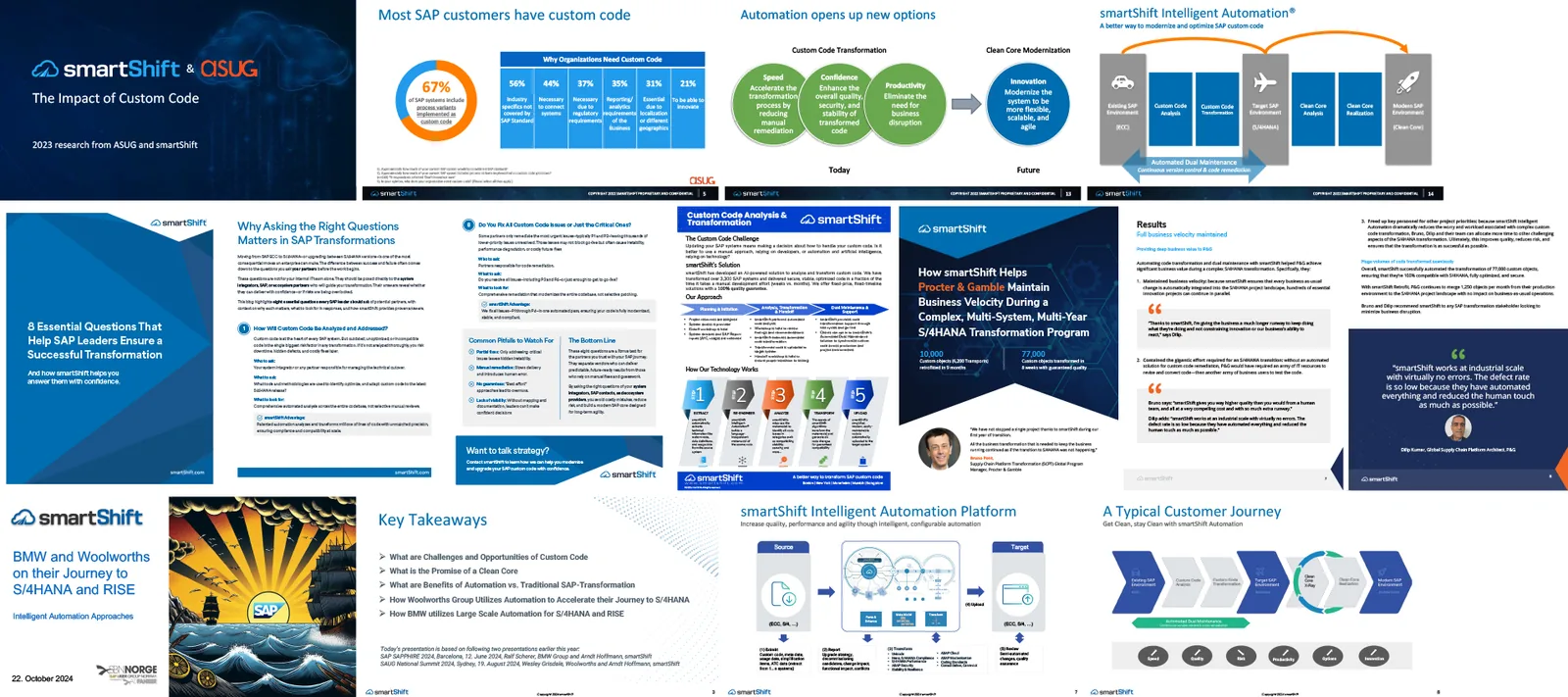
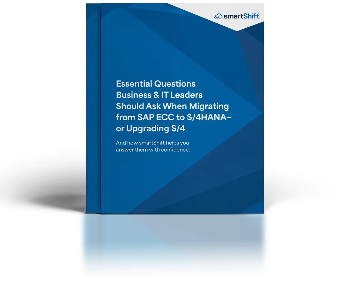
10Internal documents
Decks and documents used daily drift without a unified system. Standardised, accessible templates would reinforce the brand across every department.
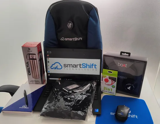
11EVP, HR & merchandise
Strong employee satisfaction suggests a positive culture. Extend the brand into onboarding, HR comms and merchandise to strengthen culture and conference presence.
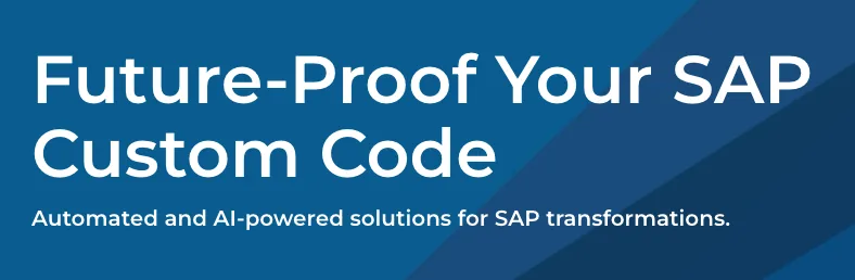
A clear foundation, held back by overly ‘smart’ language.
01Leaning on ‘smart’
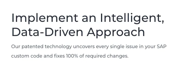
The offer is explained clearly and automated code remediation comes through quickly. But heavy use of ‘smart’ and intelligence-themed wording feels repetitive rather than focused on outcomes.

02Dense in places
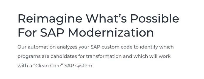
Clusters of similar terms around analysis, remediation and transformation blur together. A clearer hierarchy would sharpen the value of each part of the platform.
03Tone varies between audiences
It shifts between technical language for SAP specialists and high-level outcomes for decision-makers. Both are valid, but the transitions aren’t always intentional.
04Credible, not distinctive
Professional and trustworthy, but similar to other SAP and automation vendors. There’s room for a more confident, ownable voice that reflects leadership.
Brand growth with business growth
smartShift’s business has evolved into an automation- and AI-led platform, but the brand still communicates like a traditional enterprise services company. The current identity doesn’t amplify its technological leadership or the speed and certainty the platform delivers.
- Automation first
- AI-driven remediation engine
- Weeks, not months
- Guaranteed outcomes
- Clean Core and cloud ready
- Used by global enterprises
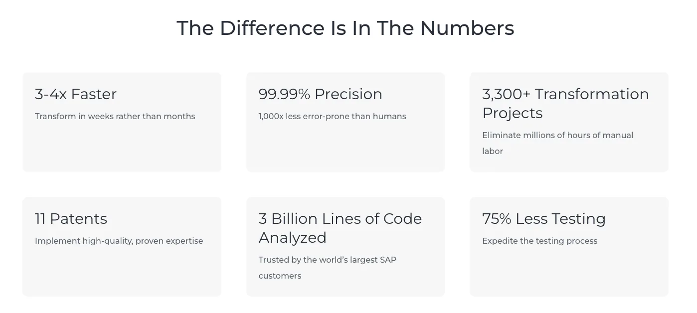
- Patented technology at scale
- Corporate blue palette and dated graphics
- Visual language rooted in the consultancy era
- Limited product UI presence
- Service-based rather than platform-based messaging
- Stock imagery and generic motion
- Inconsistent colour across channels
Impact of the gap
The brand signals a legacy SAP consultancy while the company operates as an AI-powered automation platform. That misalignment reduces perceived innovation in a market shifting fast toward automation.
- Undersells technological leadership
- Reduces confidence in automation claims
- Makes the company blend in at events
- Lowers perceived value against competitors
- Creates mixed first impressions for customers and partners
- Misses the chance to own a strong category position
We recommend evolving smartShift into a modern, automation-first identity that reflects its leadership in AI-driven code remediation, moving from consultancy aesthetics to a product-led, intelligent and dynamic design language.
A refreshed identity will strengthen market perception, increase differentiation and give the brand a unified voice that reflects the true sophistication of the technology.
- 01Modernise the visual identity to align with automation and AI
- 02Refresh or refine the logo to represent platform intelligence
- 03A unified, consistent colour system
- 04A distinct heading typeface with technical character
- 05A complete suite of motion assets that express automation
- 06A consistent, product-aligned imagery style
- 07Templates for documents, decks and internal assets
- 08A cohesive event design system
- 09Extend the brand into EVP, HR and cultural materials
The SAP ecosystem is in the middle of its largest transformation in decades.
Brand opportunity
A modernised identity would give smartShift the authority and clarity to lead the category, with a unified, AI-aligned presence across digital, product, sales, events and internal comms.
Strategic timing
A refresh timed with new product releases, new offices or a 25-year anniversary creates a strong narrative: a strategic evolution supporting growth, not a cosmetic change.
Market momentum
- ECC end of life and forced S/4HANA migration by 2027
- Strong industry push toward Clean Core
- Global shift to cloud and continuous modernisation
- Rising adoption of automation and AI in enterprise IT
- Competitors repositioning faster than their technology can deliver
Business momentum
- Proven automation results at global scale
- Growing customer base and major enterprise case studies
- New platform capabilities
- Strong employee culture and expanding footprint
- A need for a brand that reflects the technology and ambition