

This audit examines the visual and verbal identity of AccessFintech to see how well the brand is being communicated, and suggests how to improve things.
AccessFintech defines itself as “a global network connecting financial institutions to share data, streamline workflows, and resolve post-trade exceptions”.
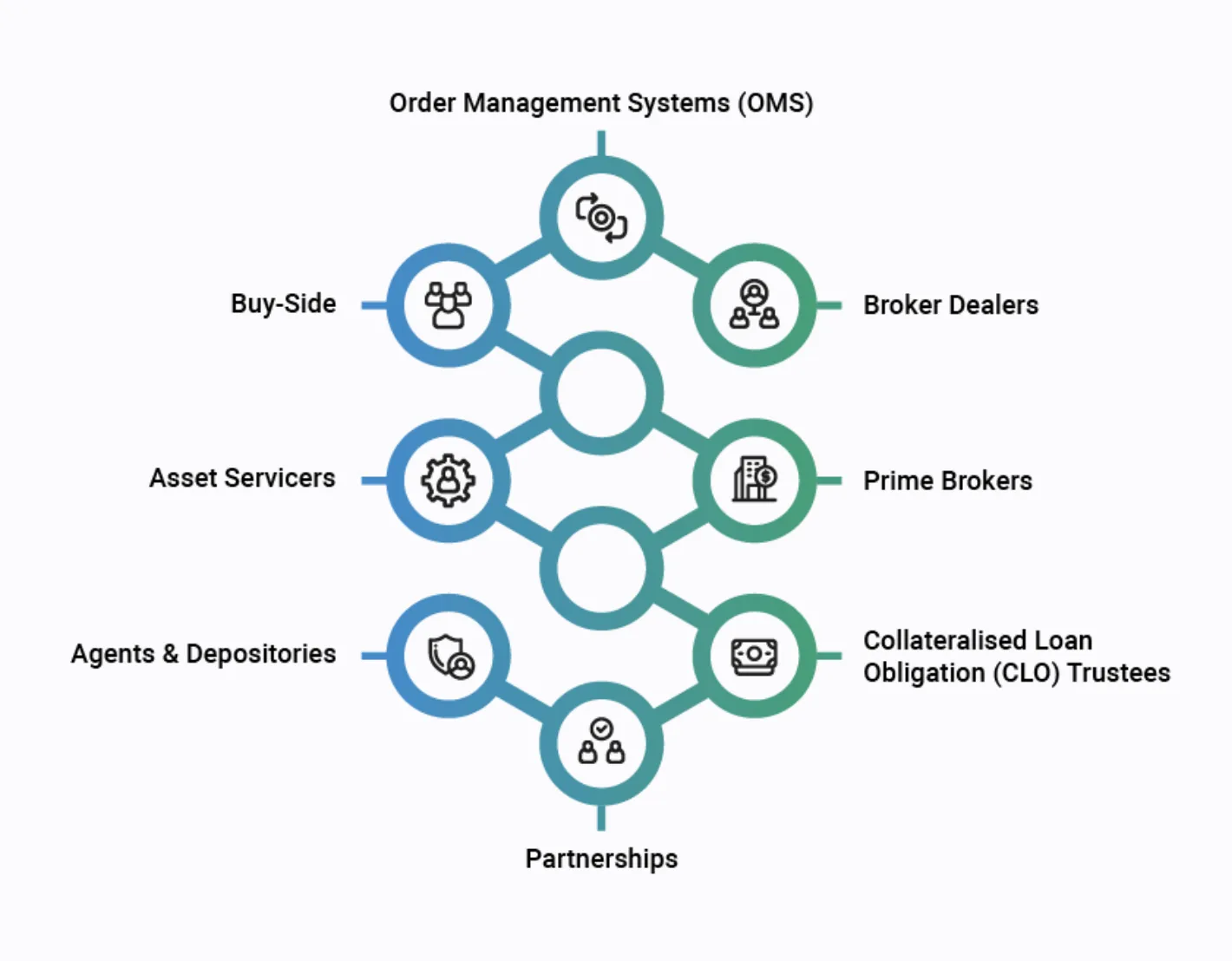
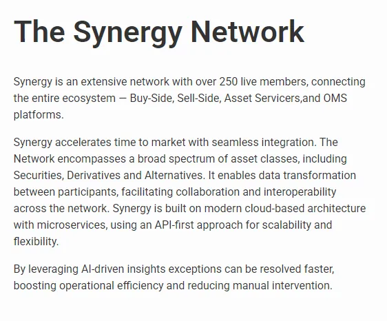
Its core product, the Synergy Network, connects over 250 live members across buy-side, sell-side, asset servicers and OMS platforms.
The company is positioned for big operational and automation shifts in the post-trade and settlement lifecycle, such as T+1 settlement readiness, and has raised a US$60m Series C to scale the business.
Competitors
AccessFintech has established itself as a trusted infrastructure player in post-trade data and workflow collaboration, but its brand and communications don’t match the sophistication of its platform.
The visual system feels dated and too soft for a fintech leading automation and transparency at scale. The verbal identity is equally technical and lacks clarity, making it hard for audiences to quickly grasp what AccessFintech actually delivers. Together, these create an impression of complexity rather than clarity.
There’s a clear opportunity to modernise and build a brand that communicates precision and momentum while still feeling trustworthy. A visual and verbal refresh would position AccessFintech as the intelligent network powering the next evolution of post-trade.
A dated visual identity
The name and proposition are solid, but the visual execution is too generic to stand out in a competitive fintech landscape.
Overly complex communication
Technical language and an unclear hierarchy make it hard for audiences to understand the offer and its benefits.
Brand architecture
If Synergy is the sole product, roll it into the main brand to strengthen recognition. If more products are planned, keep Synergy as a sub-brand within one naming and design system.
There’s the foundation of a strong, credible brand here, but it isn’t yet distinctive enough to stand out. The current design system feels soft and slightly dated next to newer, sharper fintech brands.
01Name
Excellent. Clear, descriptive and alphabetically near the top of most listings. It communicates accessibility and fintech authority.
02Logo
Simple and functional, but not particularly identifiable, unique or relevant. The two-tone wordmark stays legible and works on dark and light without reversing; a better typeface would elevate it instantly. The icon bears little resemblance to anything beyond the letter ‘A’, so it’s the first thing we’d update.

03Typography
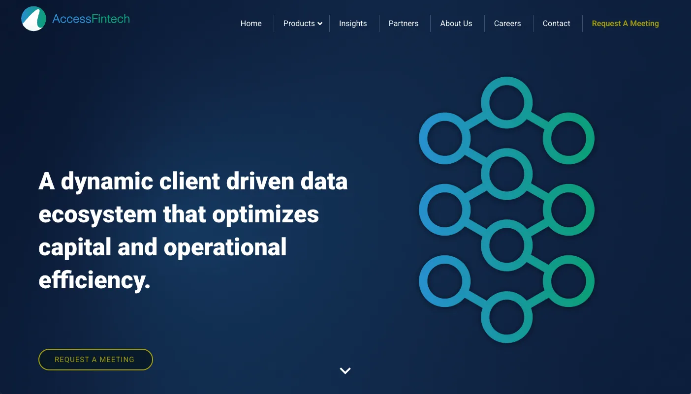
Roboto is solid but generic and adds little character. A more distinctive display face for headlines would lift the brand’s confidence, with Roboto kept as a secondary system font.
04Colour palette
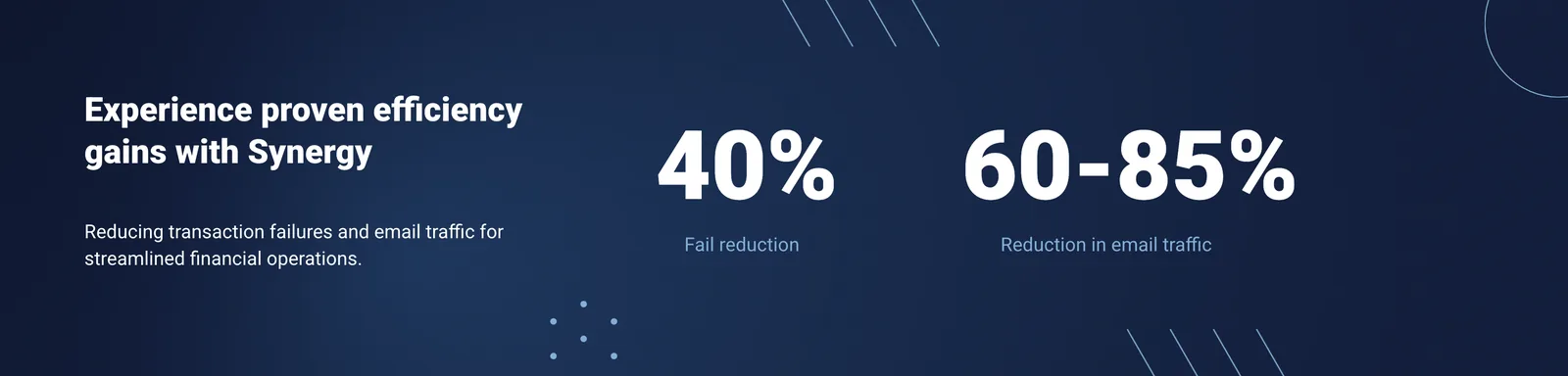
Muted blues and greens with soft gradients feel calm and trustworthy but lack contrast and punch. Deeper, more saturated, digitally confident tones with a clearer hierarchy would unify the look.


05Iconography
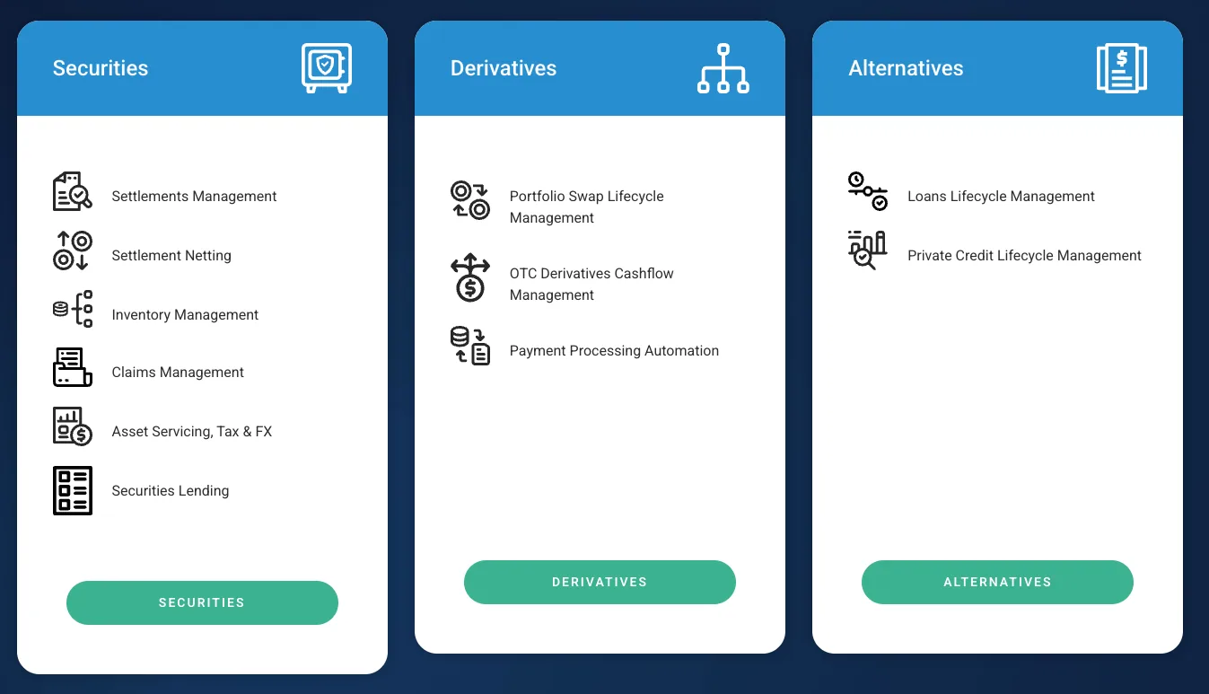
Consistent but not distinctive, with rounded treatments that mirror the soft UI. A bespoke, sharper, network-inspired icon set would make the system feel more mature and ownable.
06Imagery
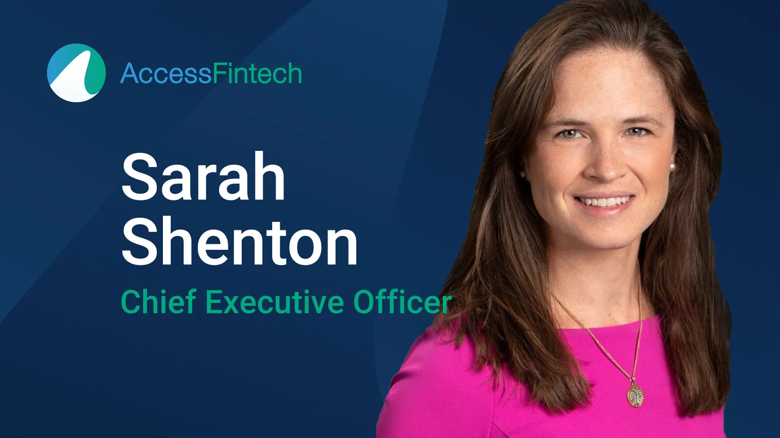
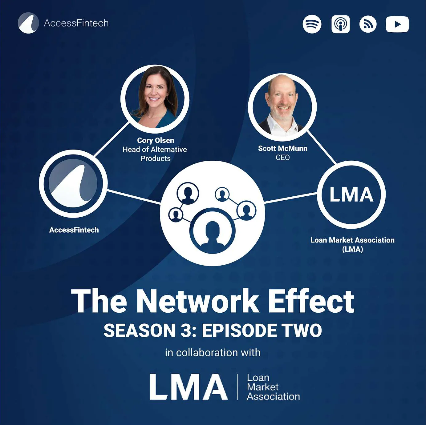
Largely generic, stock-style visuals that don’t capture what AccessFintech does. Team photos are used consistently but vary in quality. New photography is an easy win.


07Layout & UI
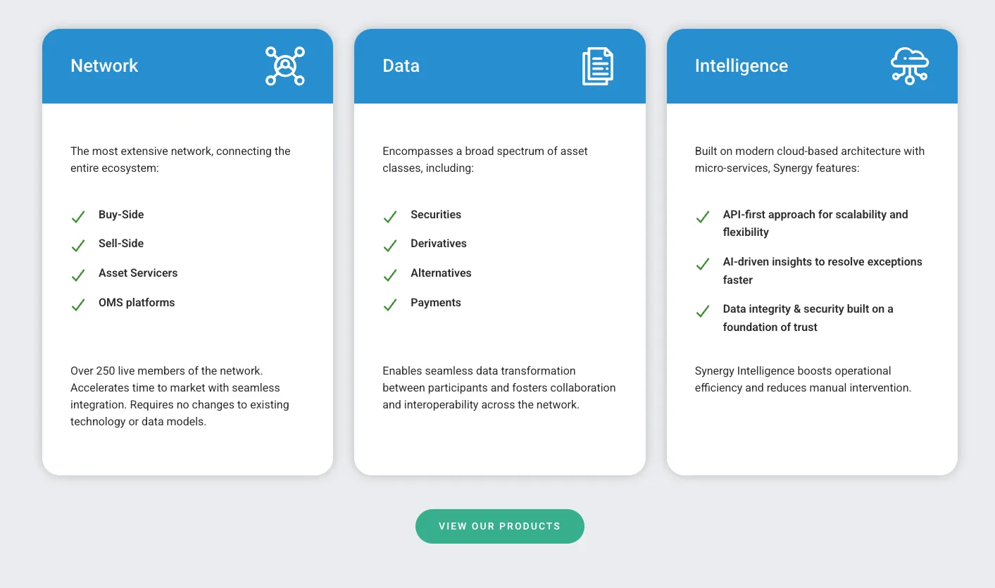
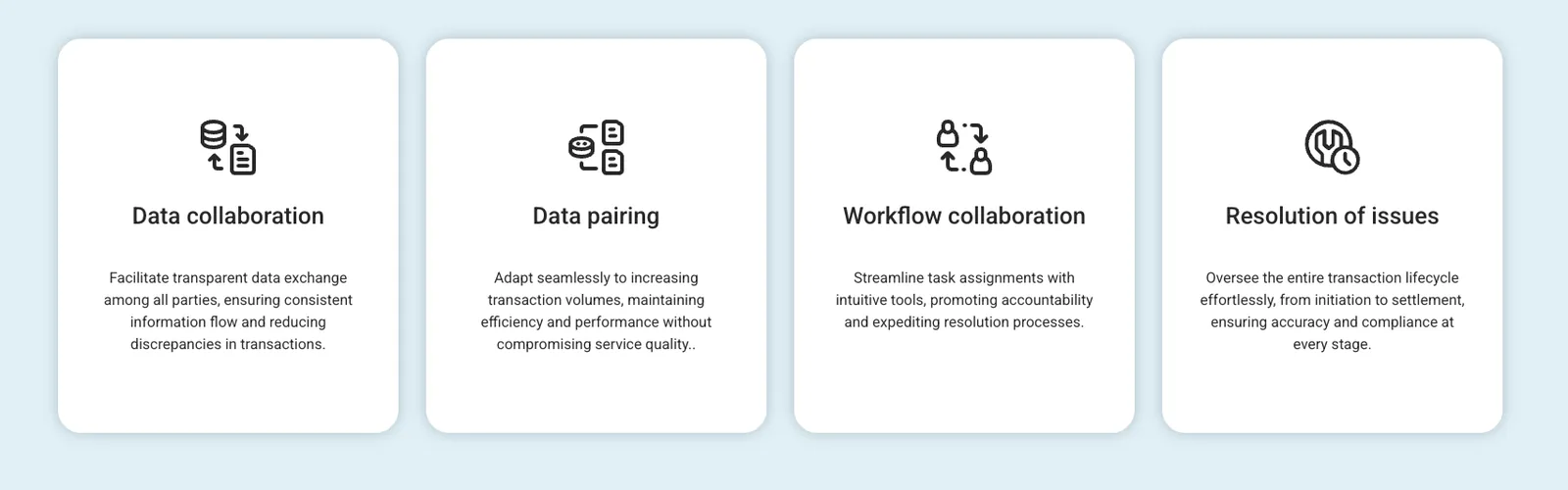
Large rounded corners give the brand a ‘soft’ feel that undermines the authority expected from data infrastructure. Reducing the radius and tightening spacing brings precision.
08Motion & 3D
The story is about network, data and movement, so motion should be central: data-flow animation and living network diagrams would bring the product to life.
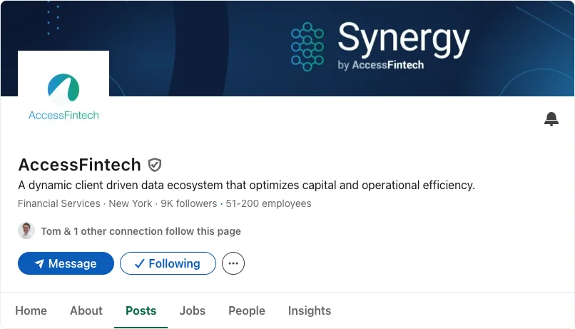
Synergy: the product brand.
01Synergy logo
Simple and functional, but not particularly ownable. The mark works better as a data-diagram concept than a standalone logo. It could evolve into a scalable system that flexes between minimal (favicon), recognisable (wordmark) and expressive (network diagram).
02Brand architecture
Synergy gives AccessFintech a clear product identity today. If the business stays centred on one platform, fold Synergy into AccessFintech. If it expands into multiple products, keep Synergy as a sub-brand within the same naming and design system.
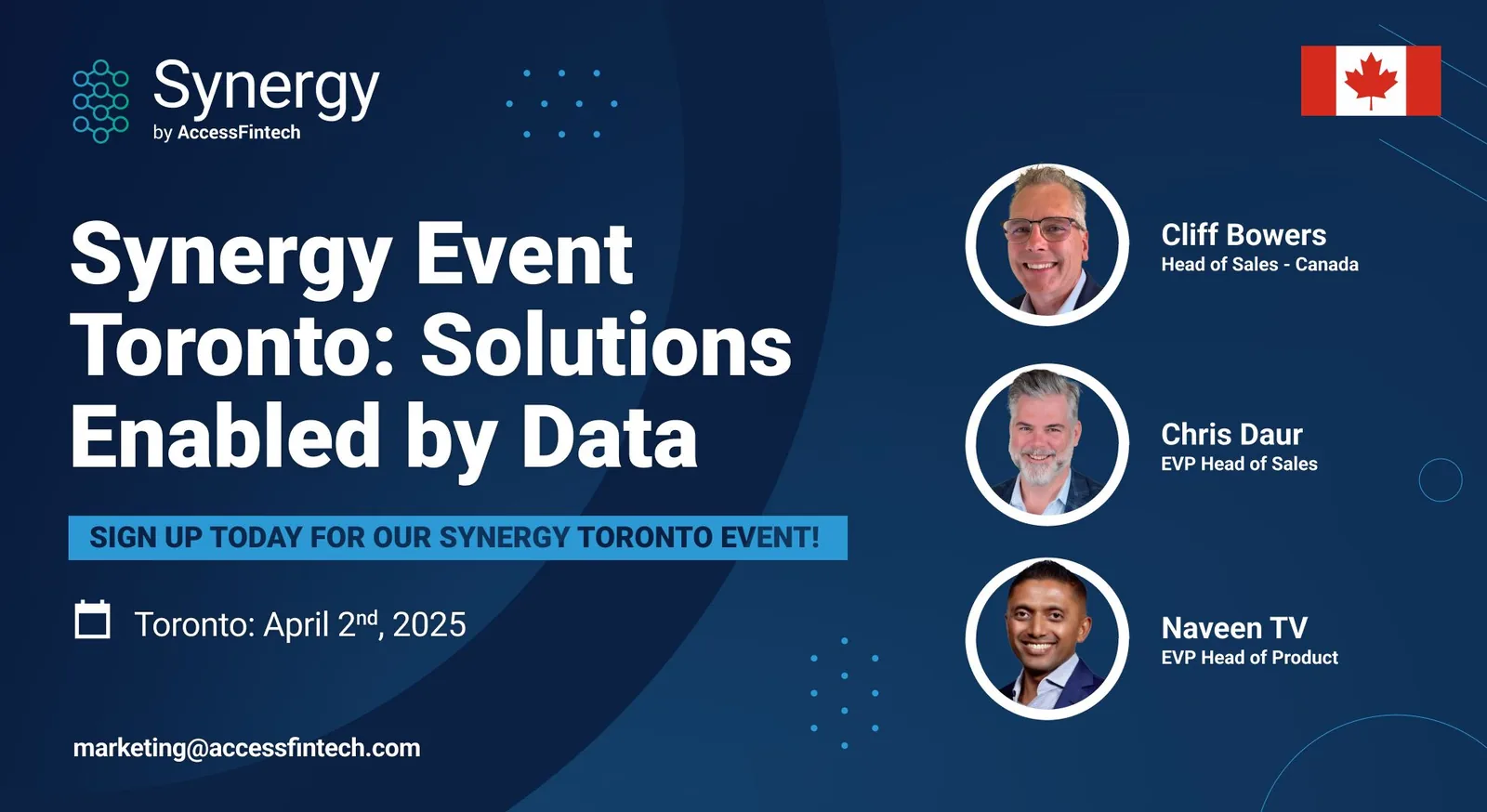
- 01Update digital branding and UI with tighter corners, refined spacing and a more precise overall aesthetic.
- 02Refine the colour palette with stronger tones and a clearer hierarchy.
- 03Replace generic imagery with conceptual graphics showing data, flow and connection.
- 04Start using subtle motion, such as animated diagrams or hover states, to visualise the ‘network’ concept.
- 05Shoot the leadership team and wider staff for authentic, brand-aligned photography.
- 06Create social templates and guidance for consistent style, layout and colour across channels.
- 01Evaluate the master brand and product architecture, including the role of Synergy.
- 02Redesign the logo with a new symbol and updated wordmark.
- 03A sharper, cleaner icon set aligned with the refreshed design system.
- 04Introduce a distinctive headline font to elevate confidence and authority.
- 05A motion-first brand system using data visualisation and movement as storytelling devices.
- 06Align printed materials, presentation decks and internal documents with the refreshed identity.
- 07Redesign the website for stronger visual storytelling and usability.
- 08New brand guidelines codifying hierarchy, layout, tone and system rules.
Credible, but buried in jargon.
01The message is buried in jargon
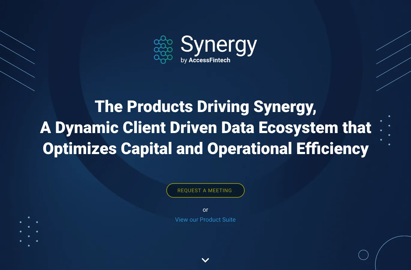
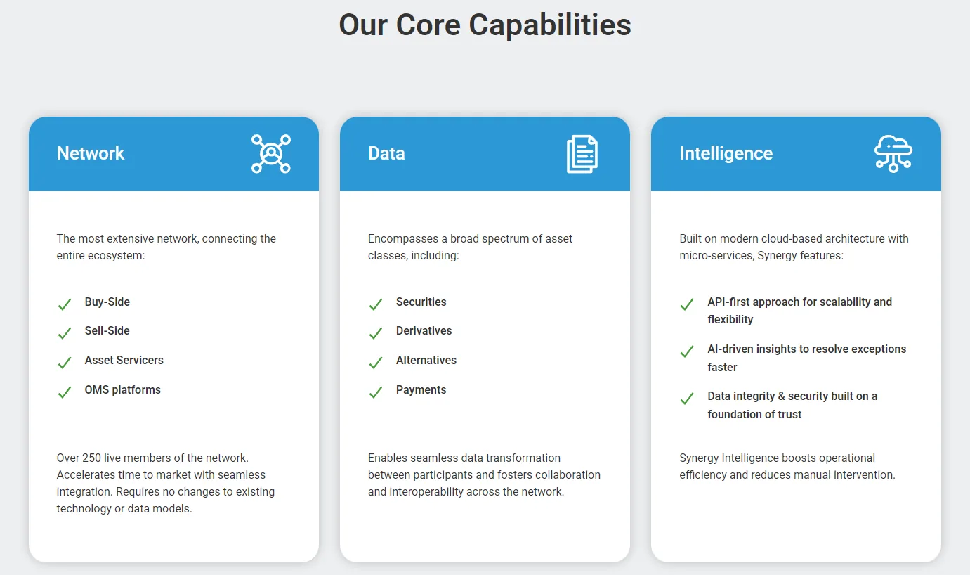
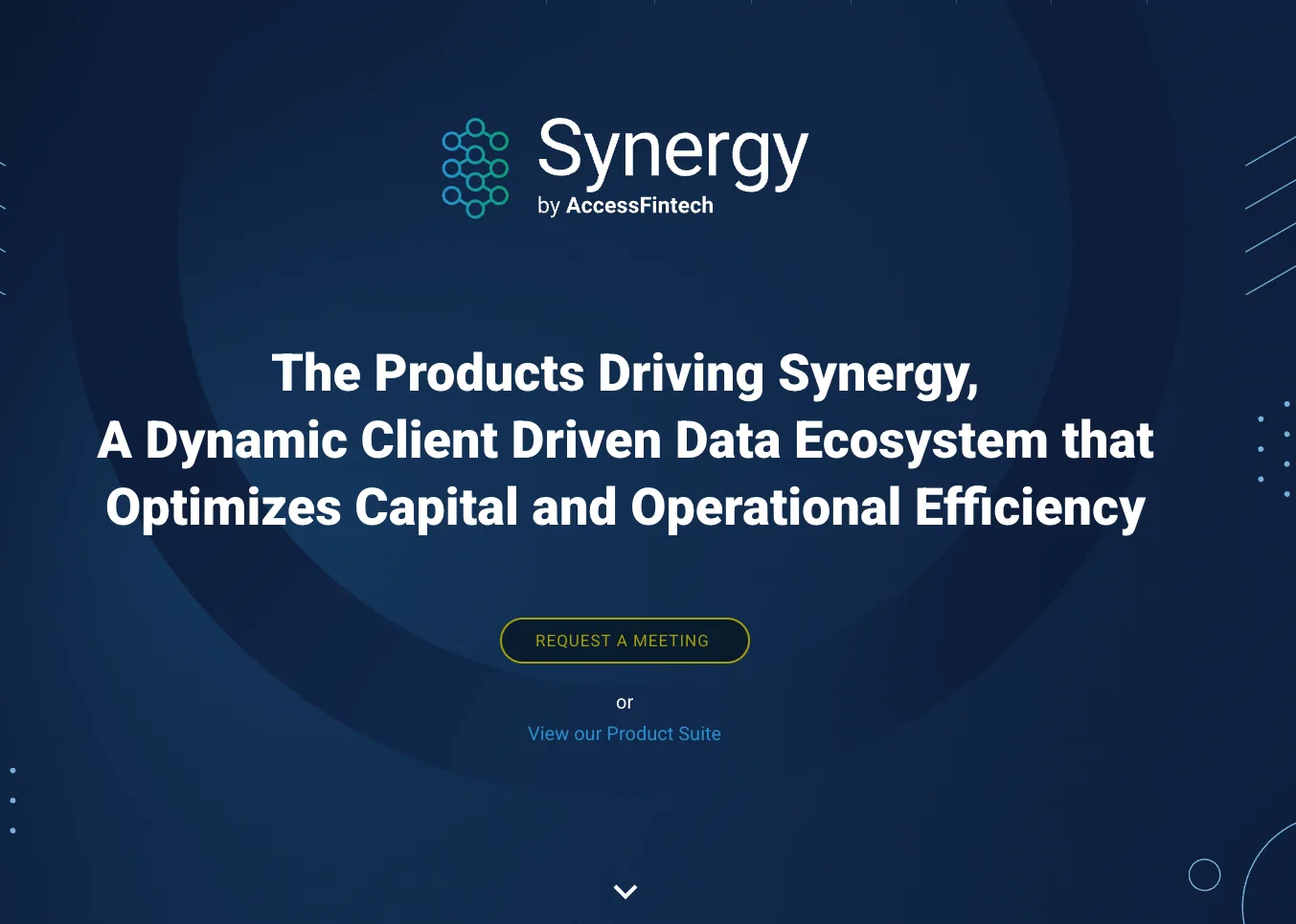
The site is packed with technical language, but very little of it says clearly what you do. Impressive-sounding phrases obscure a simple story, and the platform’s real benefit gets lost in abstraction.
02The hierarchy is muddled
Synergy Network, Capabilities, Products and Solutions are used interchangeably, leaving readers unsure where one thing stops and another begins.
03No human, outcome-led story
Everything focuses on what the platform does, not what it enables. There’s no sense of the people using it or the impact it has.
04Credible, but not distinctive
Formal, dense and safe, like many other fintech infrastructure firms. No distinct voice, tagline or message makes AccessFintech sound like the category leader it wants to be.
- 01Add a plain-English intro on the homepage that explains the offer in one sentence.
- 02Reorder copy to lead with benefits and proof before deep technical detail.
- 03Short, active headlines. Fewer nouns, more verbs.
- 04Show human outcomes through case studies or quotes that show why the platform matters.
- 01A clearer verbal hierarchy. Platform vs product vs service. At the moment customers have to figure it out.
- 02Tone-of-voice principles. Retain authority while adding warmth and clarity across all channels.
- 03A brand story. Built around transparency and collaboration to anchor future messaging.
- 04Naming audit. Simplify product architecture and reduce confusion.