

SKIN is a challenger in beauty tech, helping people save money on beauty products and discover new favourites through a connected community. This audit examines the visual and verbal identity and customer experience to see how clearly that value comes through, and how to strengthen it.
SKIN is a beauty-specific price comparison app giving savvy shoppers a smarter way to find the best deals on products they already love. But it’s more than a deal finder.
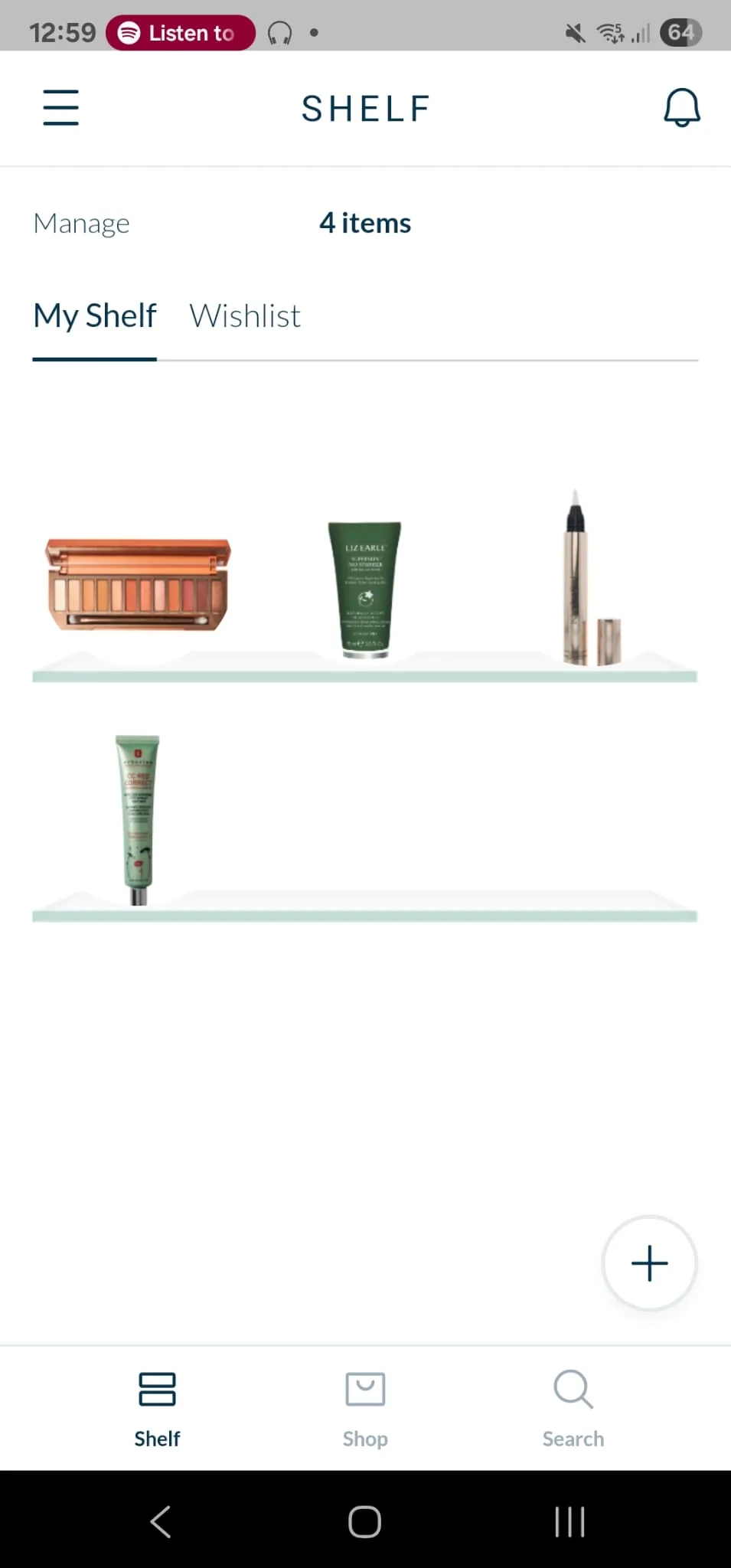
Its unique feature, the SHELF, is a digital twin of your bathroom cabinet: track your favourite products, get notified when they’re on sale, and peek at the shelves of influencers or friends. Partnerships with high-end retailers like Liberty and Sephora position SKIN as a premium alternative to traditional comparison platforms.
Short term
Clarify what SKIN is and what makes it different, with sharper messaging and a stronger visual identity that supports its premium aspirations.
Long term
A recognisable, consistent brand experience that users trust, retailers want to be part of, and the beauty community wants to engage with.
Aspirational
SKIN and the SHELF become synonymous terms in beauty: an extension of the retail experience, the place brands want to be, and the source of new beauty terminology.
SKIN has a compelling product and an exciting space to play in. It’s built around a clear consumer need and adds a layer of social discovery that could set it apart from traditional price comparison tools. But right now, the brand isn’t fully delivering on its potential.
Your retail partnerships and investor materials speak to an upmarket audience, but that premium feel isn’t reflected in the visual identity. Verbally, SKIN is friendly and functional but not always consistent. And the SHELF, one of your most distinctive features, feels underplayed.
Is SKIN a premium tool for savvy shoppers, or a social-first beauty discovery platform? It can be both, but it needs to say so with more clarity and conviction. With a few strategic tweaks, SKIN can become a must-have app for the beauty-obsessed and a powerful partner for retailers and brands.
Put the SHELF centre stage
It’s what sets SKIN apart, but it isn’t yet used to tell a distinctive or memorable story.
Elevate the visuals
From ownable assets to a premium feel, the design needs to reflect the beauty insider’s app of choice more confidently.
Find your brand voice
More consistency around key features like the SHELF would help SKIN sound as distinctive as it aims to be.
Clean and usable, but not yet premium or ownable.
01Logo
Simple and clean, which supports usability across app and web. To be seen as premium, it could be refined to add more distinction and character.
02Colour palette
Mostly white space with dark and light blue for copy, buttons and backgrounds, plus a light grey on app stores and Instagram. It doesn’t feel very intentional and comes across as sparse.
03Typography
The sans serif suggests modernity, but the spacing makes it feel spartan and utilitarian rather than premium.


04Art direction
Photography would give you more ways to communicate the brand, and another asset to own.
05Graphic elements
Very few beyond interface features. The SHELF has no visual identity of its own; icons, badges or patterns tied to it would make the brand more distinctive.
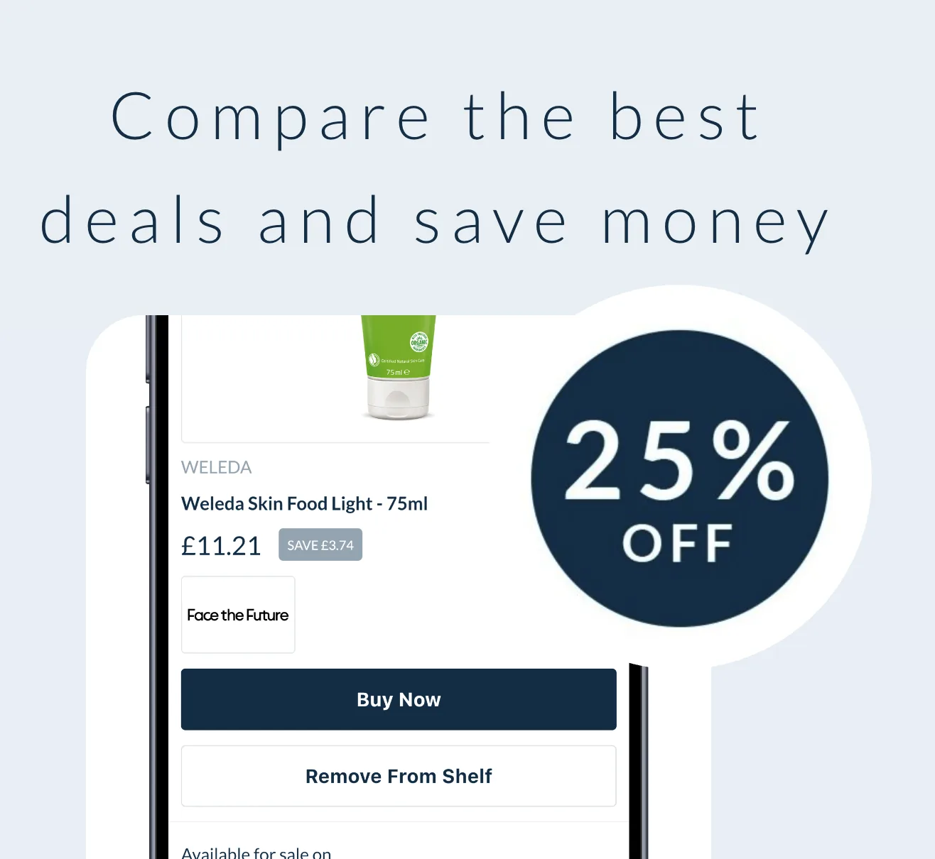
06App stores
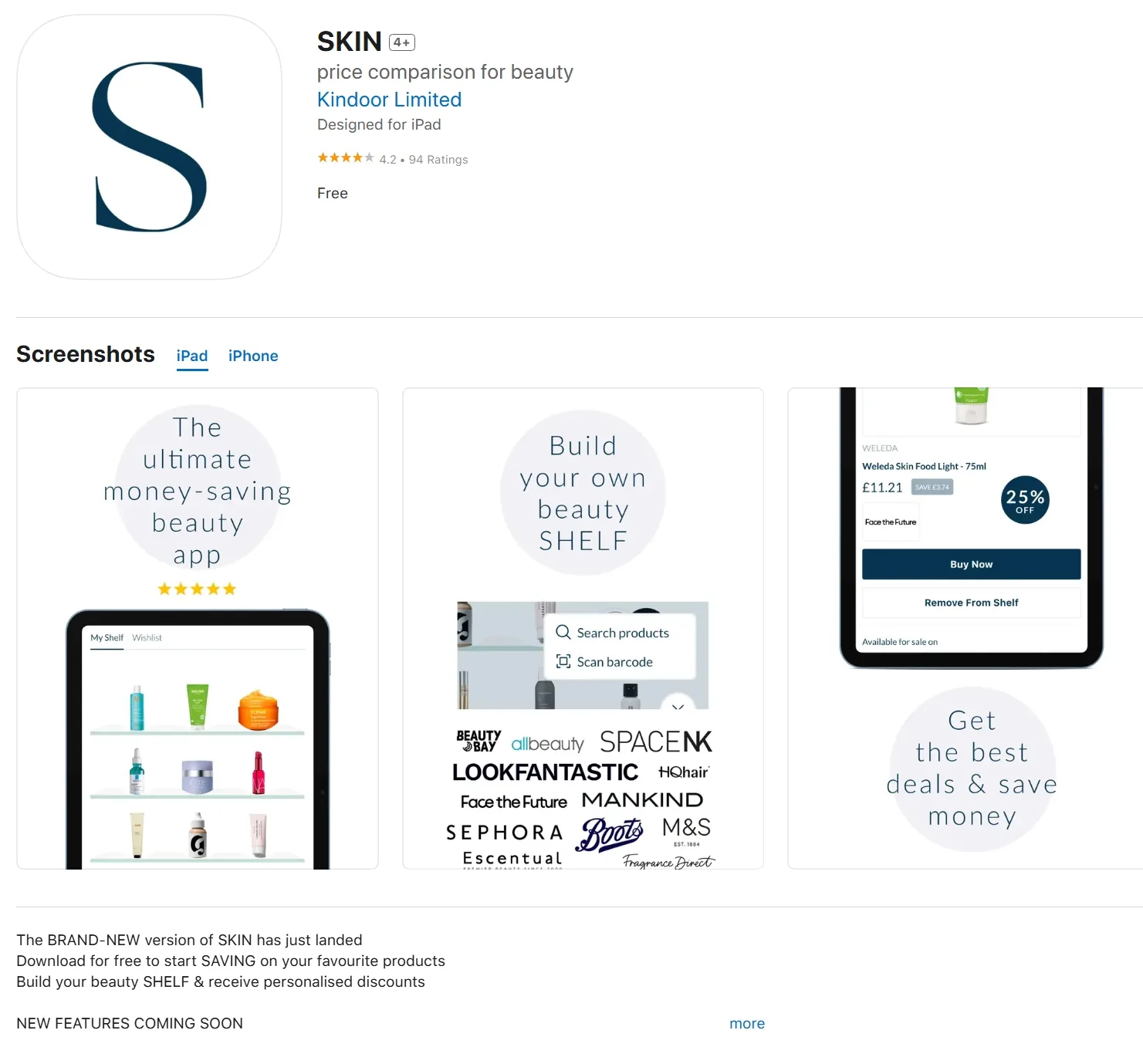
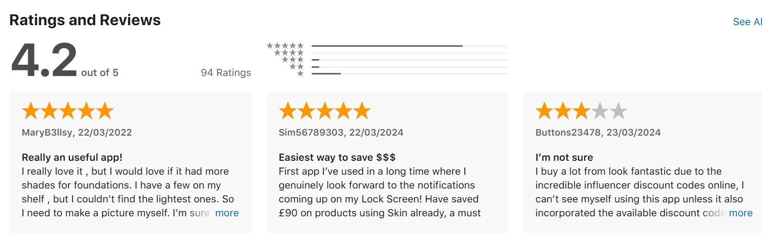
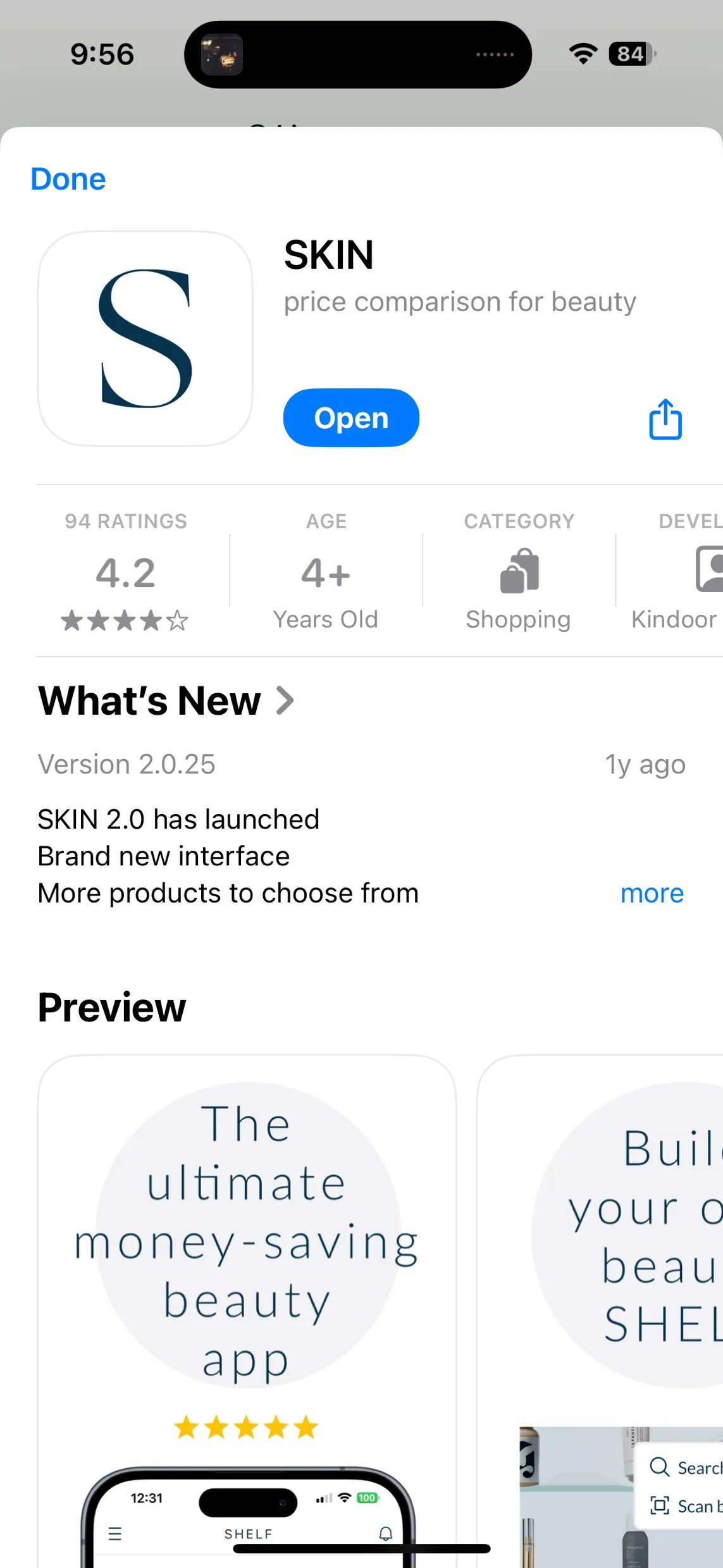
Clean and informative but visually generic: grey-framed screenshots with few flourishes make SKIN feel like a utility. A few prominent reviews also flag that it didn’t return the best prices.
07App
Very minimal, with almost no brand features beyond the logo on launch.
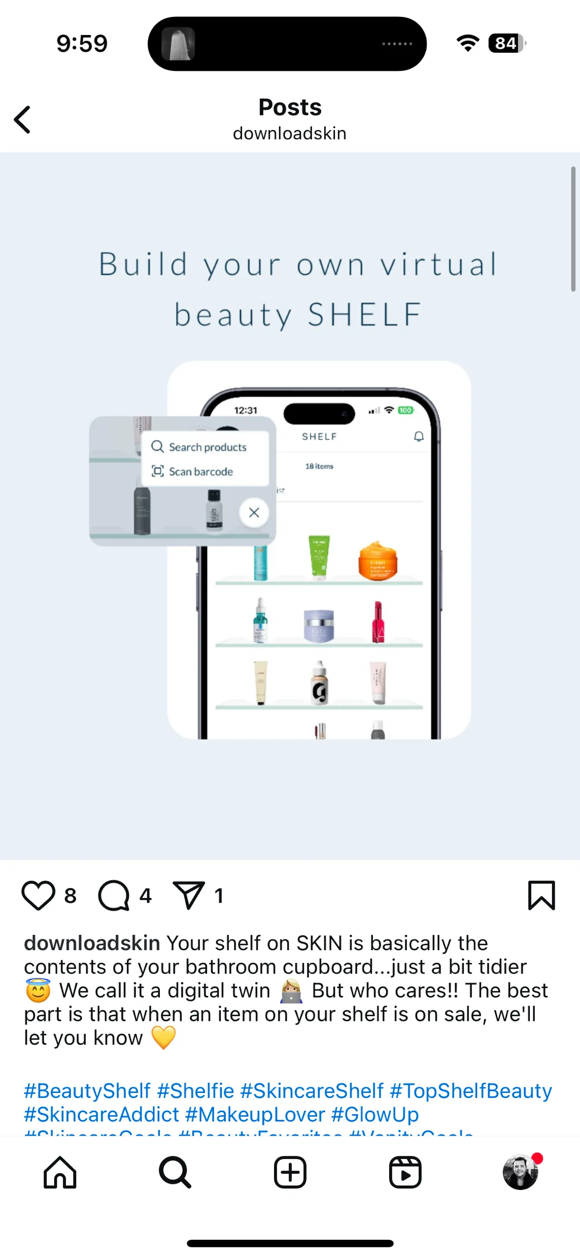
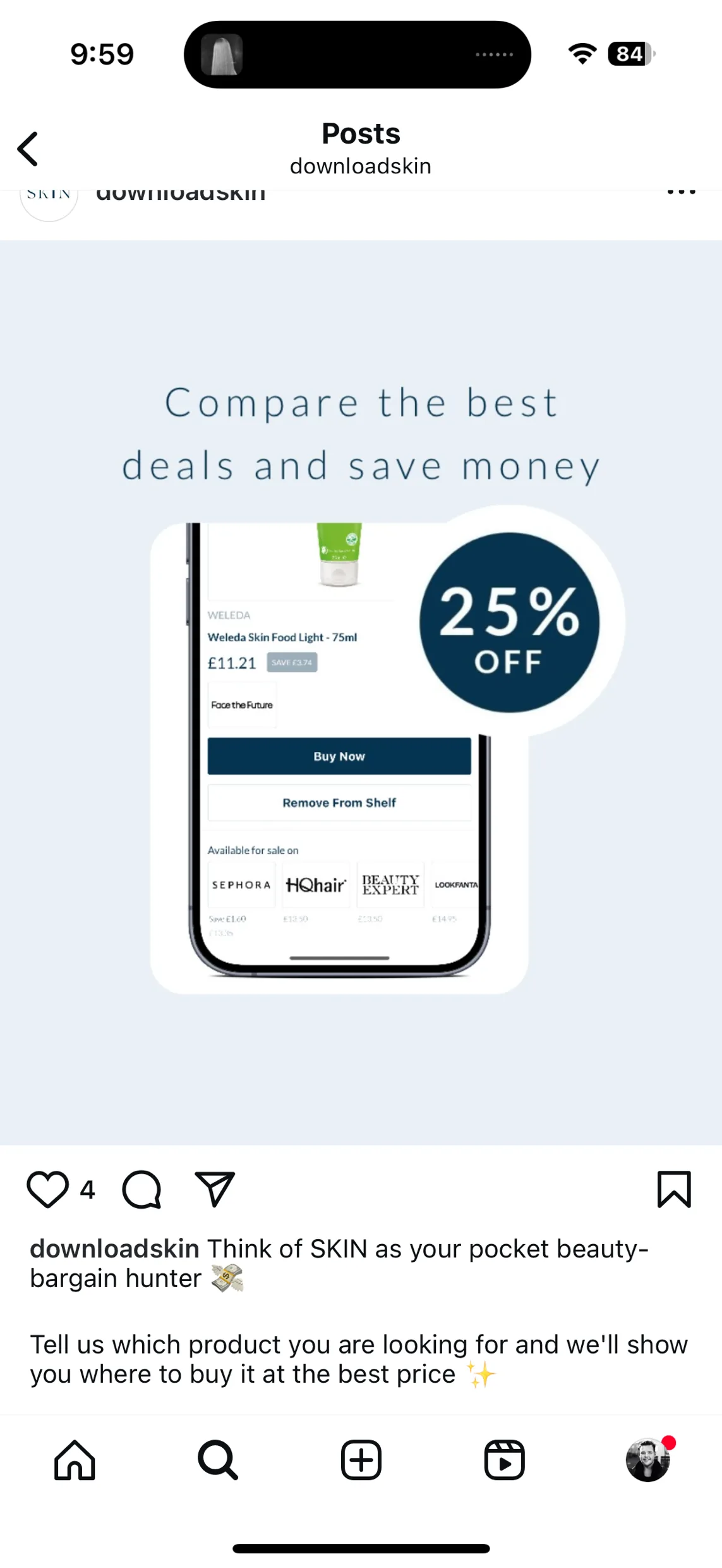
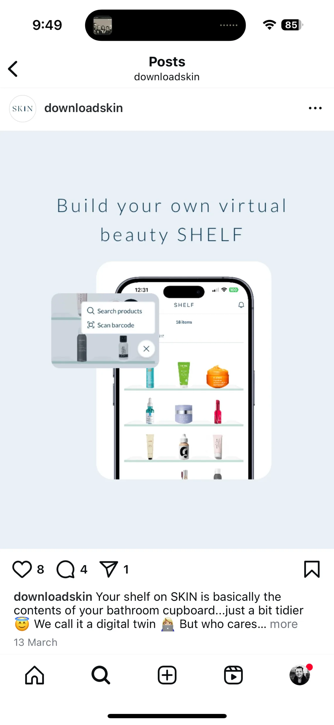
08Instagram
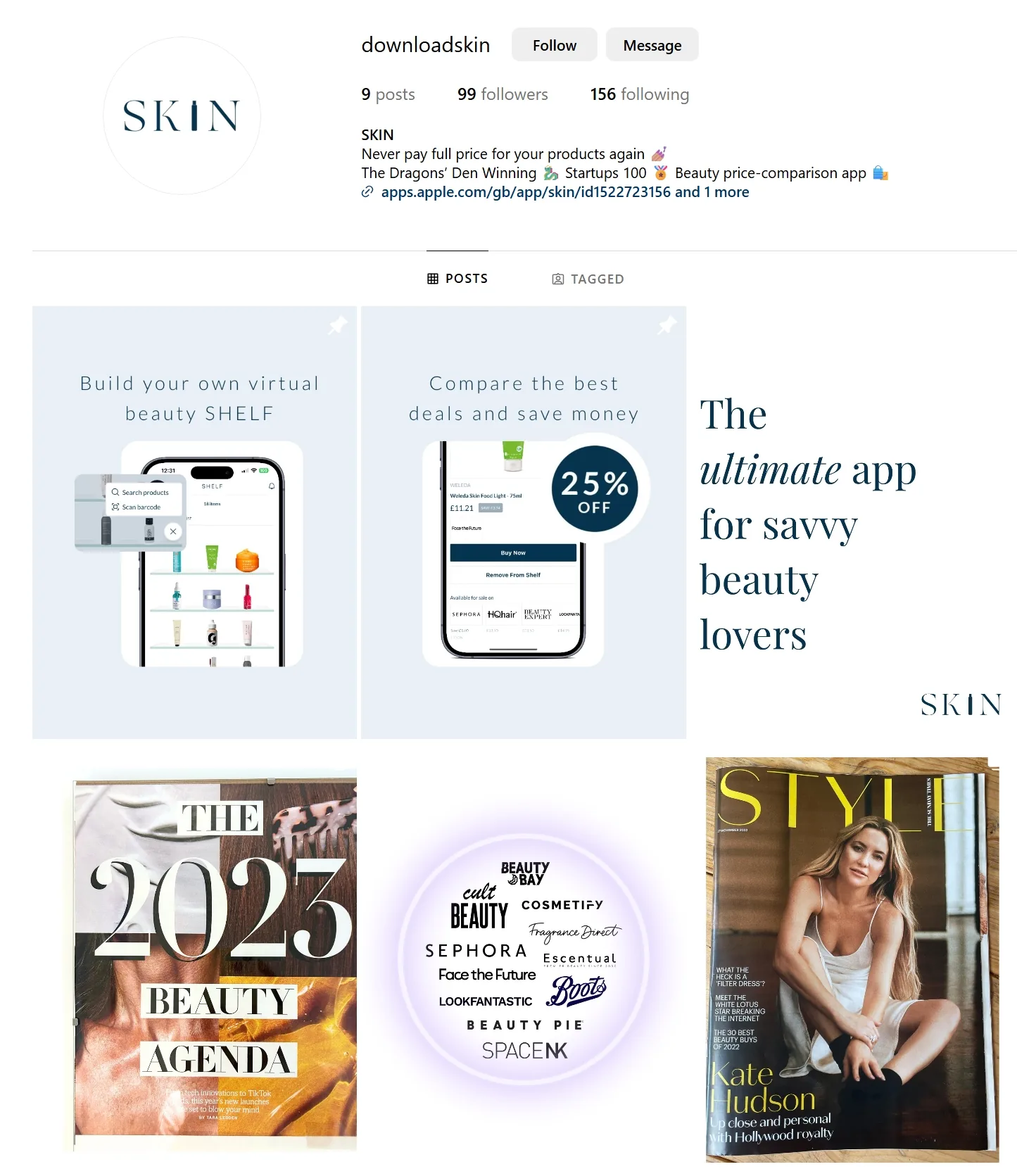
Clearly a holding page: mostly repeats of app screenshots on grey. Captions are chatty and fit the format. Lots of scope to build presence.
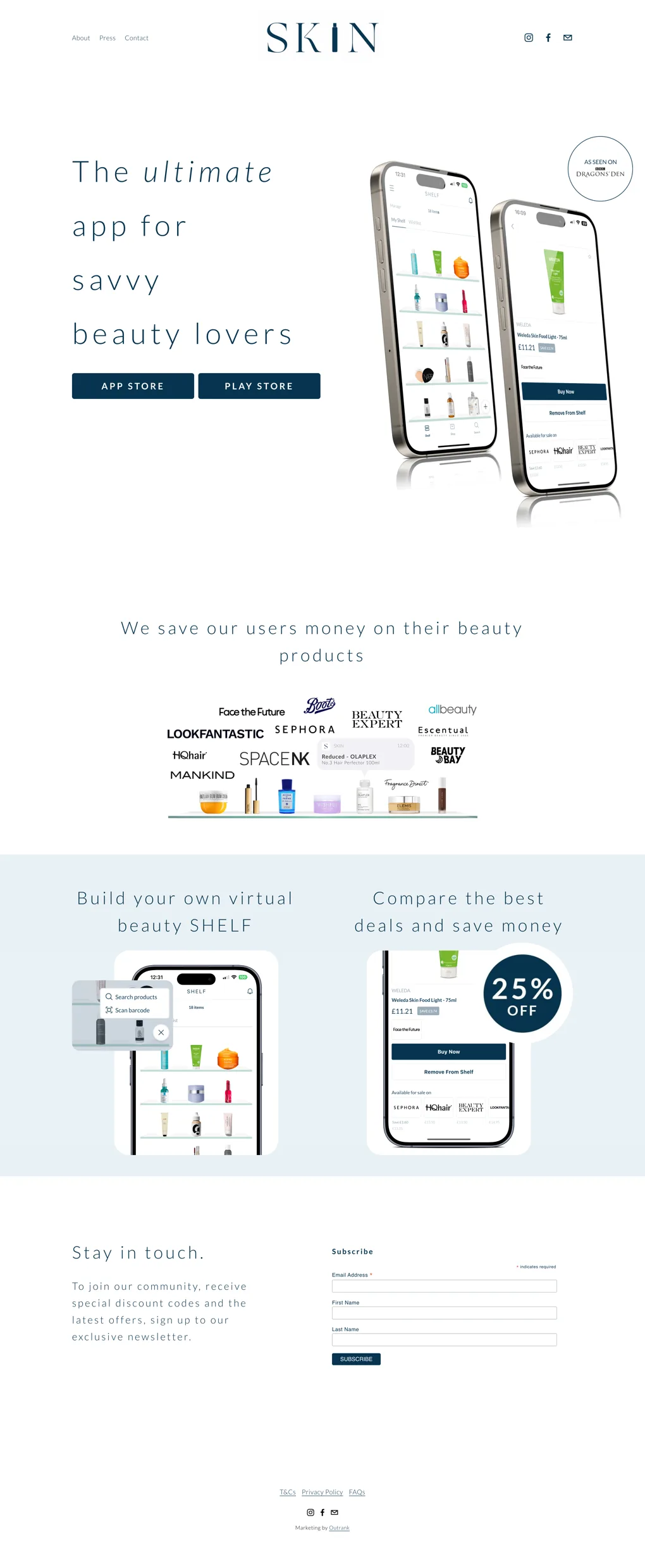
09Website
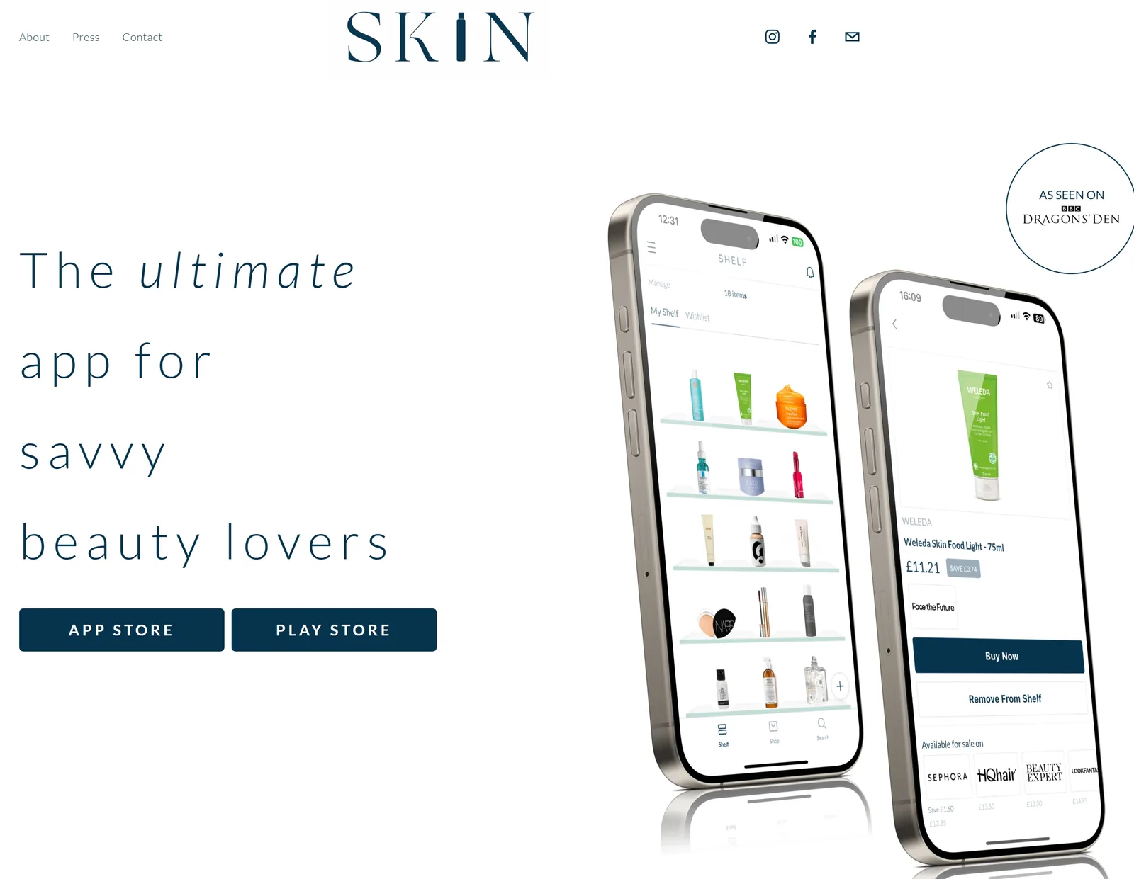
Easy to navigate but heavy on white space, with letter-spacing far too wide and few visual devices for storytelling. It reads as a price comparison engine, not a premium beauty platform.
- 01Consistency across channels. A simple design system for colour, type, post templates and icons, especially for social and app store visuals.
- 02Intentional colour. Use contrast to highlight core features like the SHELF and signal a premium option.
- 03Visual distinction for the SHELF. Even a basic motif or icon can make the SHELF ownable and memorable.
- 01Refine the logo. Better reflect SKIN’s ambition and make it work across digital and print.
- 02Photography and art direction. A bank of styled imagery that brings emotion and brand warmth.
- 03A more expressive visual language. Graphic elements, from SHELF badges to icons, that support both the functional and community sides of SKIN.
Friendly, casual and helpful. Strongest when it speaks plainly and confidently.
01Overview
Lines like “Never pay full price for your products again” work because they’re punchy and benefit-led. But messaging often explains what SKIN does, not why it matters or how it’s different.
02Channel gap
Social has more personality and charm; the website and app stores are more generic and stripped back.
03Feature descriptions
The SHELF is sometimes described warmly and playfully (“a digital twin of your bathroom cabinet”), elsewhere as “Build your beauty SHELF & receive personalised discounts.” It deserves a clearer place in the brand story: a tool, a personal space and a community feature in one.
04The challenge
Balance clarity with character: keep the helpful, friendly tone while adding distinction, confidence and a stronger sense of community and ambition.
In their words
- “We save our users money on their beauty products”
- “Never pay full price for your products again”
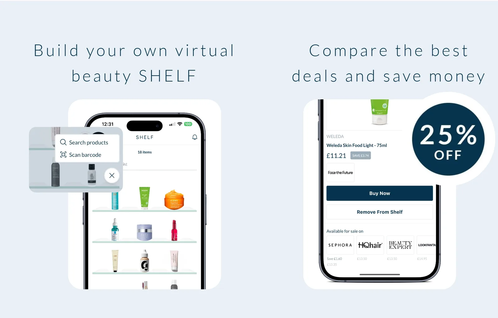
- “Build your own virtual beauty SHELF”
- “Compare the best deals and save money”
- “A digital twin of your bathroom cabinet”
- “The ultimate app for savvy beauty lovers”
- 01Sharpen headlines and taglines. More confident, distinctive core lines, with the SHELF clearly explained and celebrated.
- 02Consistency across platforms. Align tone across website, app stores and social. Social has the most charm, so bring it elsewhere.
- 03Say why it matters. Premium retailers, personalised alerts and the SHELF all deserve more attention in messaging.
- 01Tone of voice guide. A few clear principles and examples, including how to describe the SHELF and balance function with personality.
- 02Formalise your brand story. Nail down SKIN’s role in people’s lives (comparison tool, community or curator) and build messaging around it.
- 03Content strategy. Go beyond utility: shelf-sharing, beauty tips, and spotlights on trending products or users.
An app-only experience makes SKIN hard to discover without downloading.
01Beyond the app
As SKIN grows, how it exists outside the app will be central to awareness, and to making the brand an experience rather than a utility.
02Above the fold
Not enough is done to communicate what SKIN does, demonstrate the digital experience and showcase the benefits.
- 01Define the customer journey. Beyond in-app sales, when should people think of SKIN? Where does it fit in how people buy cosmetics?
- 02Focus on first touchpoints. How your story appears when people first meet SKIN: the first details, and the channels they find you on.
- 01Build a community. The SHELF feels ready-made for a community. Partnering with creators or brands could help it grow.
- 02Create behaviour change. New releases should have people checking celebrities’ shelves before checking prices. SKIN becomes part of the ritual of buying cosmetics, not just a comparison tool.