

This audit examines the visual and verbal identity of Qashio to see how well the brand is being communicated, and suggests how to improve things.
Qashio is a UAE-based fintech company offering a comprehensive spend management platform for businesses that want to streamline expense controls, corporate cards, accounts payable automation and reward programmes.
Global
Regional (UAE)
Qashio has built a strong foundation in a fast-moving, competitive category. The combination of fintech innovation with local market fluency projects trust, and your comprehensive functionality elevates Qashio from a tracking tool to more of a financial partner.
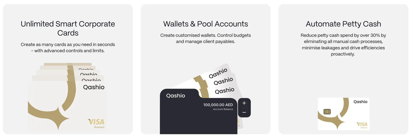
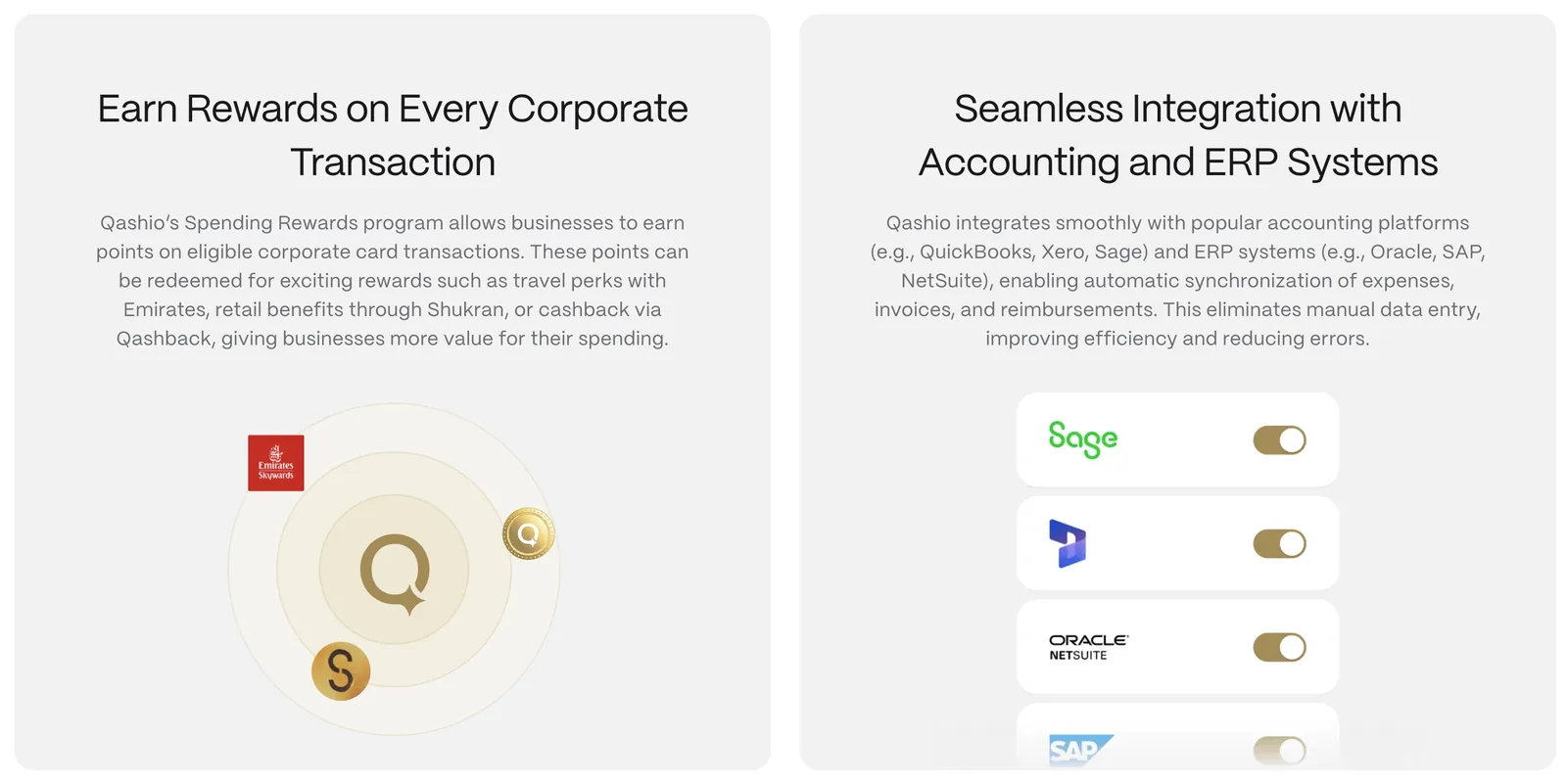
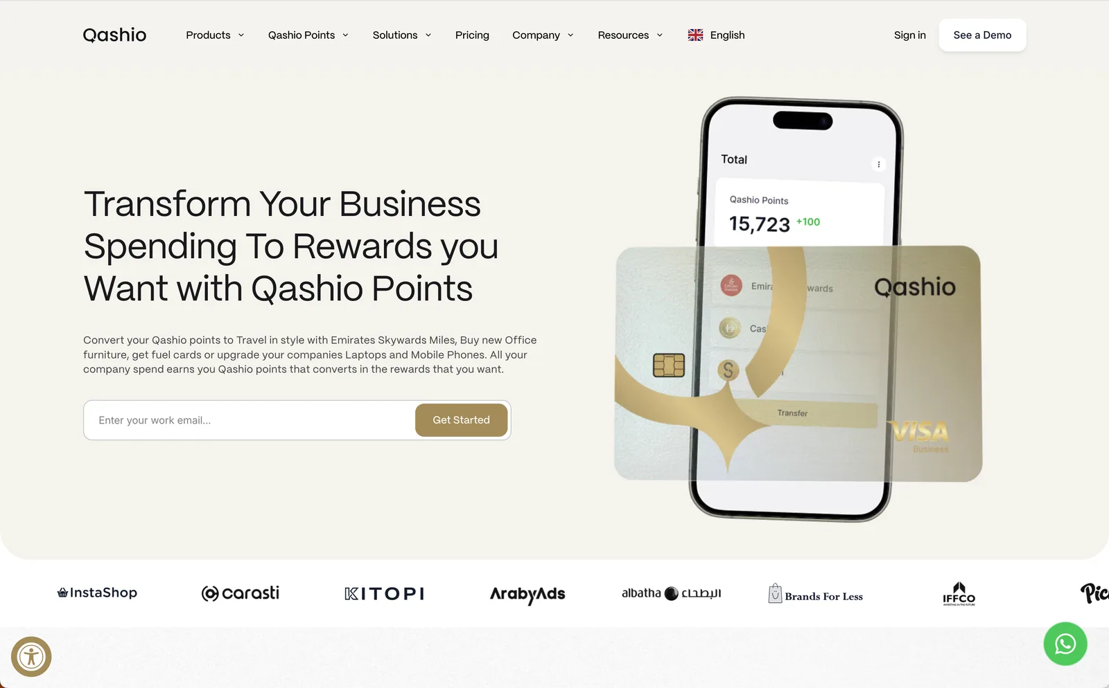
Visually, the foundation of a compelling brand is there, with gold and white suggesting luxury and transparency. However, the implementation is fairly simple and would benefit from a design system, particularly as you acquire businesses and expand: tighter art direction, more use of your ‘Q spark’ icon, and more sophisticated motion to signal the innovation your platform is known for.
The language across your website is clear and focuses on customer benefits. But there’s not much feel of ‘who’ the brand is from the website alone. There’s scope for your story to come to the fore.
Your language is clear but not distinct. Your tone leans practical when it could be confident. Qashio isn’t just another platform; it’s a statement about how business should be done in the MENA region and beyond.
Visual identity
Quite simple, with few ownable assets beyond the ‘Q spark’. Exploring how the brand shows up visually could move you from a capable fintech brand to a category-defining one.
Brand architecture
Qashio is entering hyper-growth, acquiring businesses like Sanad Cash and hiring 120+ people across numerous countries. Is the design system robust enough to scale the brand as you expand?
There are the foundations of a compelling brand here, but in its current form it’s too basic to really set you apart.
01Wordmark potential
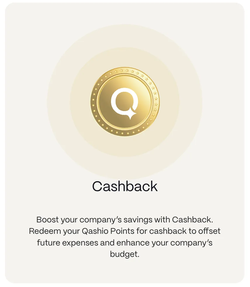
The logo’s hidden spark adds a clever touch of visual interest. It could be extended into icons, patterns or other graphic devices to give the brand more ownable assets. Tighten the kerning.
02The Qashio ‘Q’
Beyond the wordmark, there’s little that feels distinctive. Look to integrate the spark within icons or illustration.
03Colour palette
Gold accents convey a premium feel and could be used further. The use of white space makes the brand feel honest and open.
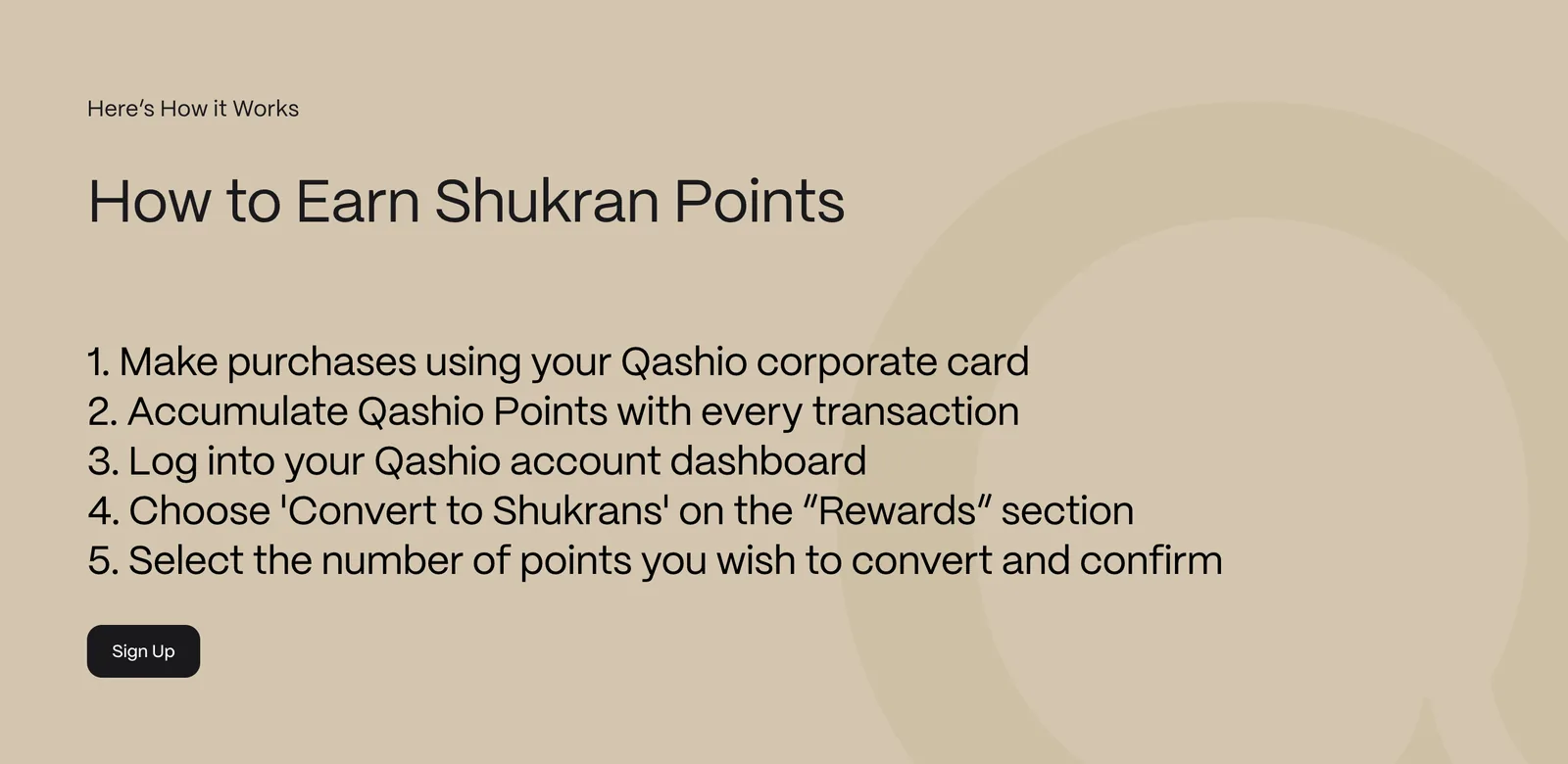
04People photography
Avoid generative AI for people imagery. It instantly loses authenticity and doesn’t communicate a high-end service. Replace with a shoot or stock.


053D & motion
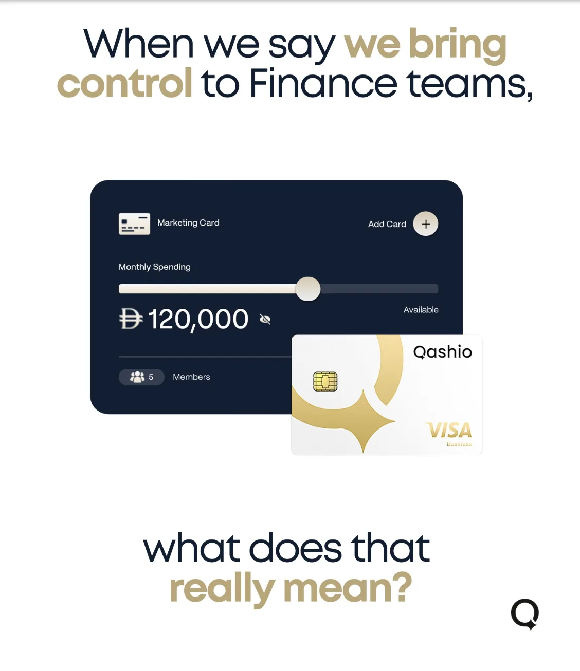
There should be a lot more motion. Strive to make Qashio a motion-first brand: use the card as a hero asset and create a graphic expression with the spark.
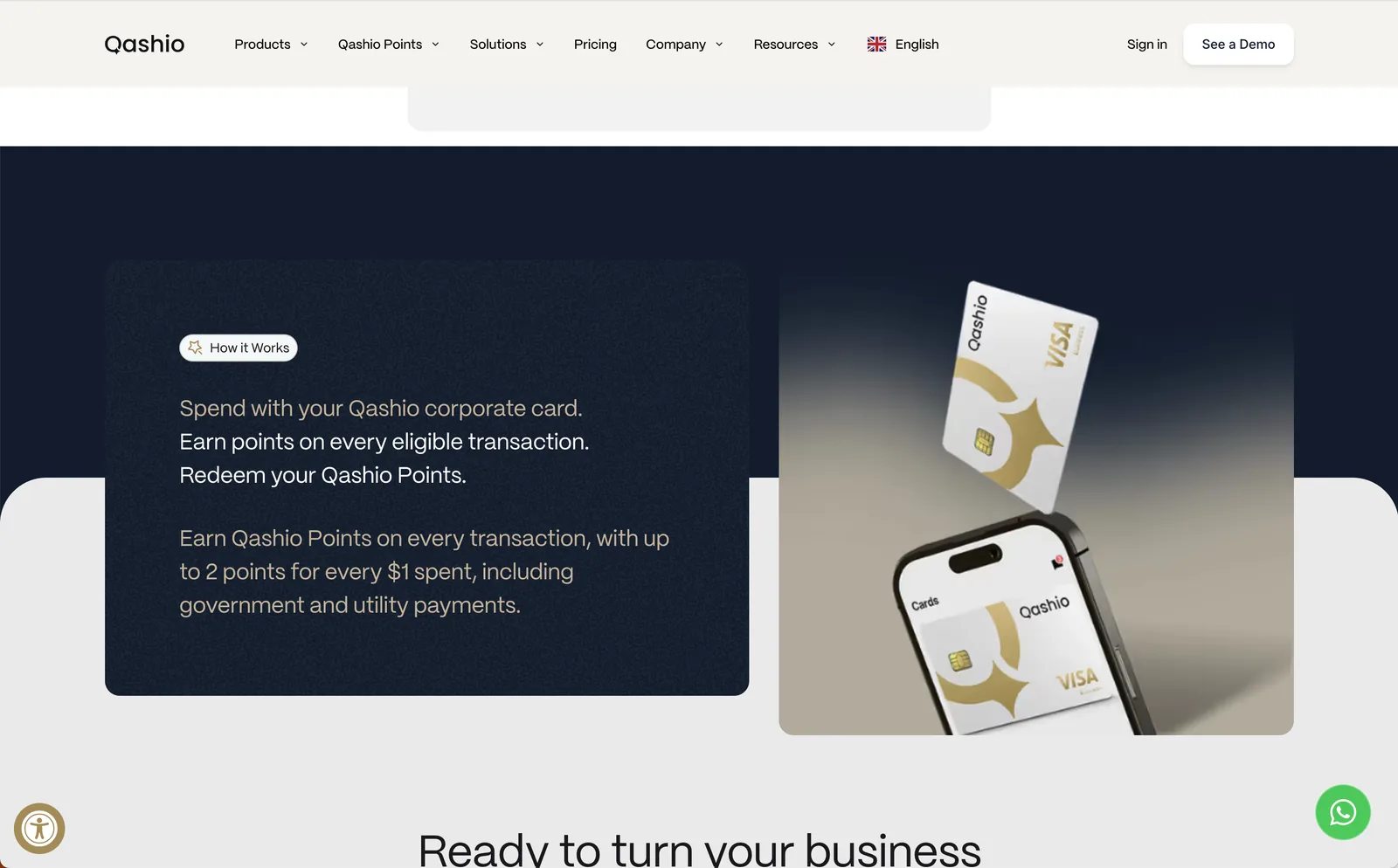
- 01Qashio ‘Q’ spark. Use the spark in more interesting ways, from integrating it within iconography to a design system that pushes its use further.
- 02People photography. People buy into people. Curate a distinctive photography library of real people and real moments to make the brand appear more trustworthy.
- 03Colour palette. The palette feels premium and the white space works well. Lean into the gold further and create a clear colour hierarchy.
- 01A richer visual system. Repeatable graphics, textures and motifs built on the ‘Q spark’. A design system that’s visually consistent and quicker to implement.
- 023D & motion. Highly polished 3D renders and expressive motion that hero the card and the spark, so the brand stands out against competitors.
- 03Website. Apply the audit’s changes: more appealing thumbnails, updated photography, motion that drives engagement, and the spark at the centre of everything.
Qashio has an opportunity to express more personality and purpose: a tone that reflects the ambition and confidence of a company redefining business finance in the MENA region.
01Clear, benefit-led language
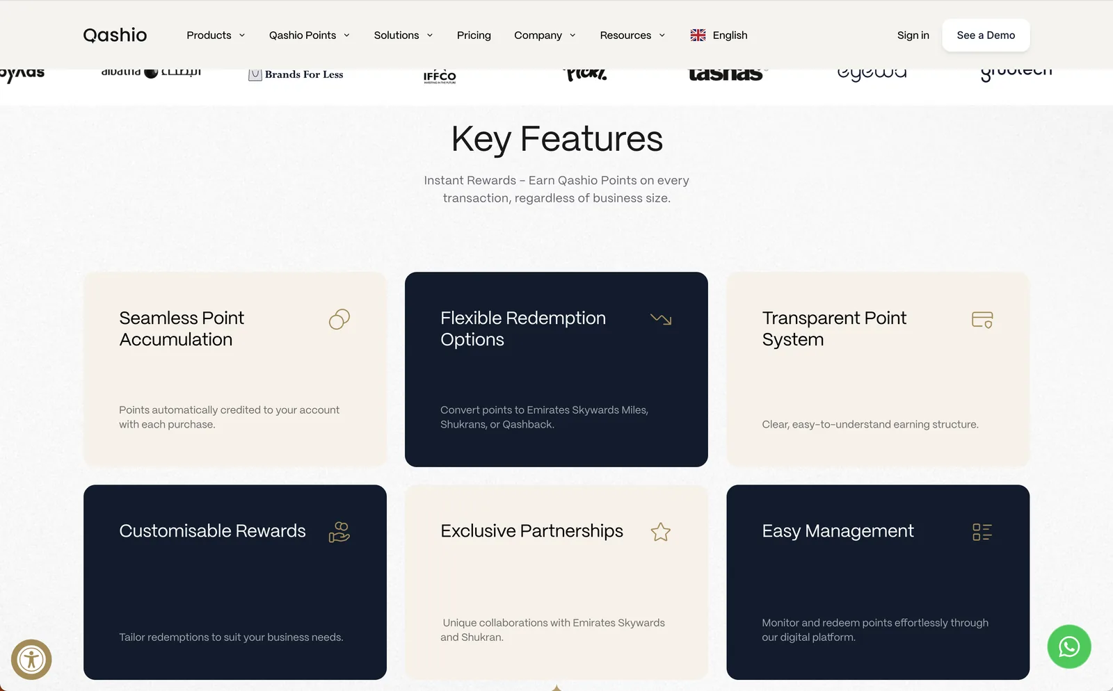
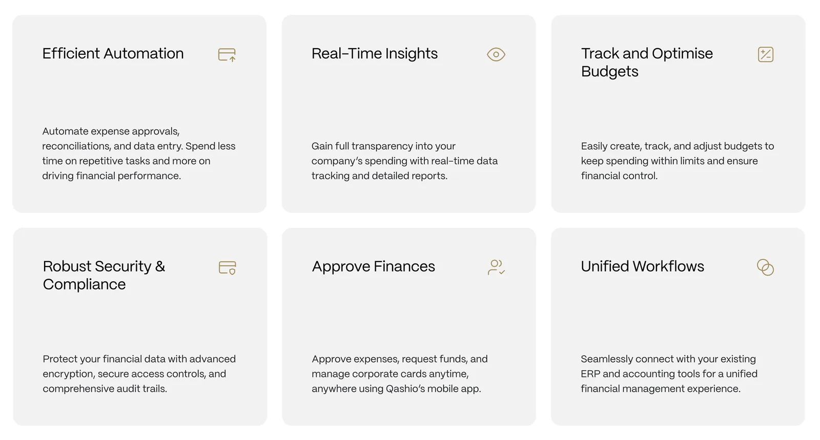
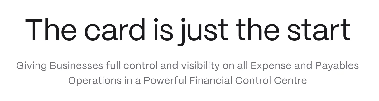
The copy is clear, concise and functional, which supports your credibility as a financial platform. It focuses on customer benefits, uses accessible language and explains the product ecosystem well.
02Tone of voice
There’s little sense of who Qashio is beyond the product. The tone is rational rather than aspirational, so while you’re easy to understand, you also sound like many other fintechs in the region.
03Security
Security is mentioned only once on the homepage. Given how closely integrated the platform can become, it’s an area we’d expect to hear more about.
- 01Consistency across web and social. Your Facebook profile says “Time is money, save both!”, which feels at odds with the more elegant website content. Social can be conversational, but it should feel part of a wider whole.
- 02Examine your values. Your company values could belong to any tech or fintech company. How could they be tweaked to highlight what makes you unique?
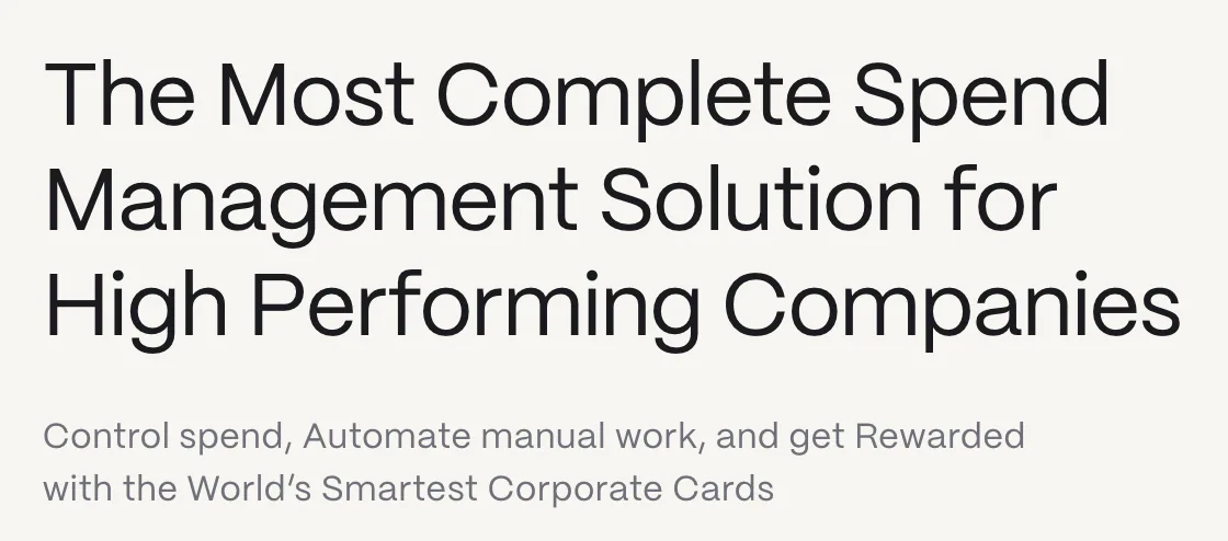
- 03Reconsider your intro line. “The Most Complete Spend Management Solution for High Performing Companies” is functional but not dynamic or unique. Does anyone get excited about ‘complete’?
- 01Formalise your positioning. Get clear on your brand values, mission and USPs.
- 02Tone of voice guidelines. A consistent, engaging way of speaking across all channels.
- 03Make more of your content. Qashiopedia and the blog are informative and SEO-driven. Push them further to establish Qashio as an industry authority.